
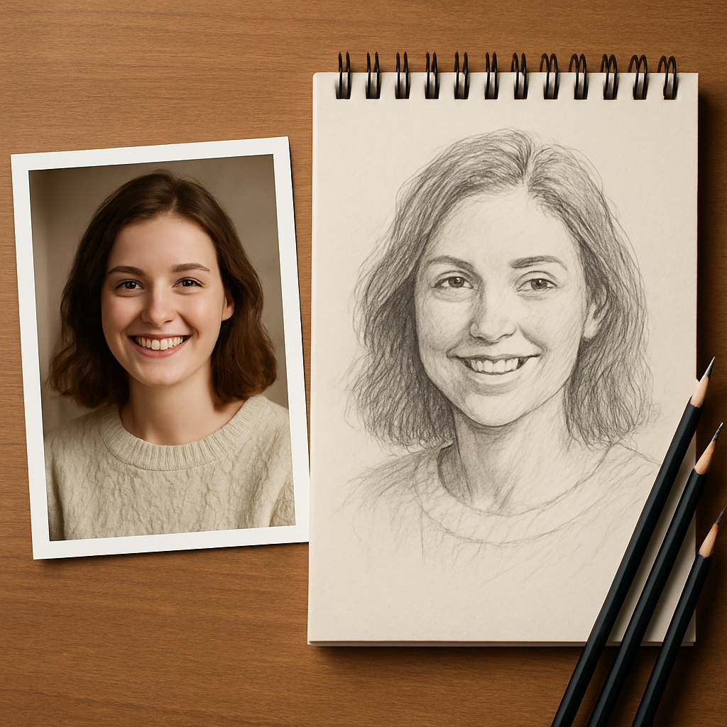
How to Create a Pencil Sketch Portrait from Photo – Step‑by‑Step Guide
Ever looked at a family photo and thought, "What if this was a hand‑drawn pencil sketch instead of a digital snapshot?"
You're not alone. Most of us have that moment when the glossy print feels a bit too flat, and we imagine the soft graphite lines, the subtle shadows, the way a pencil can capture a smile's nuance. Turning a photo into a pencil sketch portrait is surprisingly doable, and the result makes a heartfelt gift that lasts.
Here's a quick mental picture: a dad’s goofy grin at a backyard barbecue, the kids’ cheeks flushed from running, all rendered in delicate strokes that feel almost tactile. When you see that on a wall, it instantly feels more personal than a standard photo frame.
So, how do we get from a smartphone snap to that warm, hand‑sketched vibe? First, choose a clear, well‑lit reference. Natural light from a window, minimal background clutter, and a high‑resolution image give you the detail needed for shading later.
Next, think about composition. Crop the photo so the face or focal point fills most of the frame – the less empty space, the stronger the impact. If you’re comfortable, you can even experiment with a slight tilt to add a dynamic feel.
Once you have the perfect reference, there are two main routes: DIY sketch or ordering a custom service. For DIY, you’ll need a set of quality drawing pencils (HB, 2B, 4B), a smooth drawing paper, and a blending stump. Start with a light outline, then build up shadows layer by layer, always checking back to the photo for accuracy.
If you’d rather skip the practice time, many online shops turn your photo into a professional pencil sketch and print it on canvas. Custom pencil sketch portrait on canvas is a popular option that delivers a ready‑to‑hang piece without any mess.
Pro tip: ask the service to use a matte finish rather than glossy; it mimics the look of real graphite and reduces glare, making the sketch feel more authentic.
Finally, think about how you’ll present it. A simple wooden frame or a floating mount lets the sketch breathe, while a handwritten note about why you chose that photo adds an extra layer of emotion.
In short, whether you sketch yourself or outsource, the key is choosing a meaningful photo, paying attention to light, and giving the final piece a thoughtful presentation. Ready to turn that favorite snap into a timeless pencil sketch portrait?
TL;DR
Turn a cherished photo into a custom pencil sketch portrait with either a simple DIY approach or a professional print‑on‑demand service, letting you capture warm, hand‑drawn detail that feels personal and ready to hang. Follow our guide for lighting tips, material basics, and presentation ideas that you can use today.
Step 1: Choose the Right Photo and Prepare It
Before you even think about graphite, you need a photo that will translate well into a sketch. It sounds obvious, but the difference between a blurry selfie and a crisp family portrait is huge when you start shading. Think about the moment you want to capture – a dad’s laugh at a birthday, a child’s sleepy grin, or a pet’s curious stare. Those emotions become the backbone of a compelling pencil sketch portrait from photo.
Here’s a quick reality check: does the image have good lighting? Natural light from a window, preferably diffused by a sheer curtain, gives you soft shadows and highlights that a pencil can mimic. If the photo was taken at night with a flash, you’ll end up fighting harsh glare and loss of detail. A simple test – open the picture on your computer and zoom in to 200%. Can you still see the texture of the skin, the strands of hair, the sparkle in the eyes? If yes, you’re on the right track.
1️⃣ Pick the right resolution
Aim for at least 300 dpi if you can. Most smartphones now shoot 12 MP or more, which is plenty. If you’re pulling an older photo from a phone album, try to find the original file, not a compressed thumbnail. Higher resolution means more detail for you to interpret into graphite tones.
Real‑world example: Sarah wanted a sketch of her grandparents’ wedding photo from 1978. The original 35 mm slide scanned at 2400 dpi gave her enough grain to see the subtle crease in the bride’s dress – something a low‑res JPEG would have lost.
2️⃣ Simplify the background
Busy backgrounds pull the eye away from the subject. If you can, crop the image so the person or pet fills most of the frame. A plain wall, a soft outdoor blur, or a simple curtain works best. If you can’t re‑shoot, use a photo editor to blur or clone‑out distractions – just keep the subject’s edges clean.
Pro tip: when you’re prepping the photo, convert it to black‑and‑white first. This lets you see where the contrast naturally lives. If the subject blends into the background in grayscale, you’ll need to adjust lighting or choose another shot.
3️⃣ Check focus and sharpness
Out‑of‑focus eyes are a deal‑breaker. Zoom in and make sure the eyes, lips, and any defining features are razor‑sharp. If the eyes look mushy, the sketch will feel lifeless. If you have a blurry favorite, consider re‑shooting – it’s worth the extra effort.
Consider the case of Tom, who tried to use a candid photo of his dog running in the park. The motion blur smeared the fur, and his final sketch looked like a watercolor smear. He went back, snapped a still shot with the dog sitting, and the result was a crisp, detailed portrait.
4️⃣ Prepare the file for the service (if you’re outsourcing)
If you decide to let heartful.gifts handle the drawing, they ask for a high‑resolution JPEG or PNG under 10 MB. Keep the color profile sRGB, and avoid heavy compression. You can upload directly from the product page – for example, check out the custom wallart collection for inspiration on how the final piece will look on your wall.
Make sure the file name is simple (e.g., family‑portrait‑2024.jpg) – some services strip weird characters and you don’t want a missing file glitch.
5️⃣ Optional: Print a test strip
If you’re DIY‑inclined, print a 4 × 6 in version on matte photo paper. Hold it up to a light source; the darker areas will be your shadows, the lighter spots your highlights. This quick test helps you plan the pencil pressure levels before you even pick up a tool.
So, what’s the next move? Grab your phone, head to a bright window, and snap a few shots. Review them with the checklist above, pick the one that feels the most alive, and you’ll have a solid foundation for a beautiful pencil sketch portrait from photo.
Step 2: Transfer the Image to Paper
Now that your photo is prepped, it’s time to get that picture onto your drawing surface. Think of it as moving a memory from a screen to a tactile page – the kind of moment that makes a pencil sketch portrait from photo feel truly personal.
Why transfer at all?
Because trying to eyeball every proportion can feel like guessing a puzzle in the dark. A light transfer gives you a reliable roadmap, so you can focus on shading and expression instead of worrying you’ve misplaced a nose.
Does the idea of a perfect outline sound intimidating? Not really – it’s more like setting up a friendly scaffolding that you’ll later tear down.
What you’ll need
- Printed grayscale version of your photo (8.5×11 works well)
- Tracing paper or thin butcher paper
- Graphite transfer paper (or a simple DIY carbon sheet)
- Tape (artist’s tape or painter’s tape)
- A smooth drawing paper – Bristol board or heavyweight sketch paper
- A soft pencil (HB or 2B) for the initial lines
Got everything? Great. Let’s get hands‑on.
Step‑by‑step transfer
1. Print the reference. Print your edited photo in grayscale at the size you want the final sketch to be. If you’re working on a larger format, scale the print accordingly – the bigger the paper, the more room you have for subtle tonal shifts.
2. Secure the paper. Tape the printed photo to a flat surface. Then tape your drawing paper on top, making sure the two sheets line up perfectly. A little overlap at the edges helps keep everything steady.
3. Apply the transfer medium. If you’re using carbon paper, place it shiny side down between the photo and your drawing paper. For a DIY carbon sheet, rub a graphite stick over a sheet of regular paper, flip it, and use the dark side.
4. Trace the essentials. With a soft HB pencil, gently trace the main outlines – eyes, nose, mouth, and the overall shape of the head. Don’t worry about capturing every wrinkle; just the big forms that guide your shading later.
5. Check alignment. Lift a corner and compare the transferred lines with the photo underneath. If something looks off, adjust the tape and trace again. This is the perfect moment to ask yourself: “Does this feel right?”
6. Lighten the guide. Once you’re happy with the outline, go over it lightly with a kneaded eraser. You want the lines to be faint, like a whisper, so they won’t dominate the final sketch.
7. Start shading. Now the fun begins – you can build shadows, blend, and bring the portrait to life, always glancing back at the photo for reference.
Sound familiar? If you’ve ever used a projector in a classroom, this is the same principle, just on a smaller scale.
Alternative: The grid method
Some artists swear by the grid. Draw a simple 1‑inch grid over both the photo and your drawing paper, then copy each square one by one. It sounds tedious, but it forces you to notice proportions you’d otherwise miss.
Does the grid feel too “school‑yard”? Try a light ruler and only mark the corners of the face – that can give you enough reference without turning the whole page into a checkerboard.
Pro tip: Use a lightbox
If you have a lightbox (or even a bright window with a glass table), place the photo on top, then your drawing paper, and trace directly. The backlit image shows through, letting you follow the lines with a steady hand.
Here’s a quick visual walk‑through that shows the whole process in action:
When the outline is set, you’ll notice the sketch feels less like a guess and more like a translation of a memory. The rest of the steps – adding depth, blending, and finishing touches – becomes a natural extension of that solid foundation.
Ready to move forward? Grab your tape, lay down that transfer, and let the pencil do the storytelling.
Step 3: Sketch the Basic Outlines
Alright, the transfer is on the table and the light is just right. Now it’s time to let your pencil do the talking by sketching the basic outlines. Think of this as drawing the skeleton of a story – you don’t need every detail yet, just the shape that holds everything together.
Start with light, confident strokes
Grab a soft HB or 2B pencil and press lightly. You want lines that whisper, not shout. A gentle touch lets you erase or adjust without scar‑ifying the paper. If a line feels off, just lift the eraser and smooth it out – it’s completely normal.
Remember the photo you transferred? Look for the biggest landmarks: the hairline, the chin, the outer edges of the shoulders. Sketch those first. This gives you a framework that you can flesh out later.
So, what should you actually draw first? Try this quick checklist:
- Overall head shape – oval or round, depending on the angle.
- Mid‑line down the face to keep the features symmetrical.
- Eye line – usually about halfway between the top of the head and the chin.
- Nose and mouth placement – use the “one‑third” rule (eyes to nose, nose to mouth).
Does that feel overwhelming? It isn’t. Each bullet is just a tiny anchor you can verify against the transferred guide.
Use the “measure with your pencil” trick
Hold your pencil horizontally, align one end with a reference point, and use the other end to gauge distance. It’s a low‑tech way to keep proportions honest. For example, the width of an eye is often about the same as the distance between the eyes. Slide your pencil across the sketch and see if it matches – if it doesn’t, tweak the outline.
Here’s a little anecdote: I once tried to eyeball a smile on a family photo and ended up with a grin that looks more like a grin‑monster. A quick pencil‑measure saved the day and the portrait stayed sweet rather than scary.
For a visual walk‑through of these outline techniques, see this quick sketching tutorial.
Don’t chase perfection – capture the flow
Outlines aren’t meant to be rigid. They should follow the natural curves of the subject. If you’re drawing a child’s cheek, let the line curve gently rather than forcing a straight edge. This tiny imperfection actually adds life later when you start shading.
And if you’re feeling stuck, pause. Look at the transferred image for a second, then close your eyes and picture the shape. Often the brain fills in the gaps better than the eye does on paper.
Check alignment and adjust
Every few strokes, lift a corner of the paper and compare your lines with the faint transfer underneath. Is the jawline drifting left? Is the eyebrow too high? Small corrections now prevent big re‑draws later.
Pro tip: use a kneaded eraser to lift excess graphite without leaving a harsh white spot. It’s perfect for softening lines you’re unsure about.
Set the stage for shading
Once the basic outlines feel solid, darken only the most important guide lines – the outer contour and the main facial planes. Keep everything else faint. When you move on to shading, these faint lines act like a roadmap you can glance at without them stealing the spotlight.
Think of it like laying down a light‑hearted sketch before the drama of shadows takes over. The transition from outline to tone feels natural, and you’ll notice the portrait gaining depth faster.
Ready to move on? Grab your blending stump, pick a 4B for the deeper values, and let the pencil bring the portrait to life. The basic outlines you just built are the sturdy bridge between a flat transfer and a warm, hand‑drawn pencil sketch portrait from photo.
Step 4: Add Shading and Texture
Now that your outlines are set, it’s time to let the shadows do the storytelling. Shading is where a flat transfer becomes a warm pencil sketch portrait from photo that feels like a memory you could reach out and touch.
Gather the right tools
First, pick a pencil range that gives you control from whisper‑light grays to deep, velvety blacks. Most artists swear by a 2B for the base tones, a 4B for mid‑range shadows, and a 6B for the darkest pockets. If you’re curious about which brands deliver consistent darkness without crumbling, check out this pencil brand guide for a quick rundown.
Grab a blending stump, a soft kneaded eraser, and a piece of smooth Bristol paper – the smoother the surface, the cleaner the transition between values.
Step‑by‑step shading workflow
1. Light‑to‑dark mapping. Hold the reference photo up to a lamp and notice where the light hits the cheek, the nose bridge, and the hair. Light areas stay almost untouched; the deepest shadows get a heavy 6B press.
2. Block in the base layer. Using a 2B, sweep broad, gentle strokes over the whole face. Think of this as laying down a thin gray wash – you’re not trying to get the exact shape yet, just the general tonal mass.
Does it feel too flat? That’s where the blending stump steps in.
3. Blend, don’t smudge. Lightly rub the stump in circular motions, letting the graphite settle into a smooth gradient. If you notice streaks, go back with a clean side of the stump – you want a seamless fade, not a smudged mess.
Pro tip: keep the stump’s tip small for tight areas like under the eye, and larger for broader planes like the forehead.
4. Deepen the darks. Switch to a 4B and press a bit more where the hair folds into the neck or the eye sockets recede. Remember, a little pressure goes a long way – you can always add more later.
And what about those ultra‑dark spots that give the portrait that “pop” feel? That’s the 6B’s moment.
5. Add the final blacks. Dab the 6B sparingly on the darkest edges – the pupil, the hair roots, the shadow under the chin. Too much can make the piece look muddy, so build it up gradually.
After you’re happy, lift a tiny bit of graphite with a kneaded eraser to create highlights – a tiny lift on the cheekbone or the tip of the nose can make the whole face spring to life.
Texture tricks that add realism
Hair isn’t just a block of darkness; it’s a forest of strands. Use short, directional strokes that follow the growth pattern. For skin, a gentle cross‑hatch can suggest pores without overwhelming the portrait.
Think about clothing or background elements – a soft stipple works great for fabric, while a smooth gradient works for a simple wall.
So, what should you do next? Take a step back, squint, and ask yourself: does the light‑dark contrast read like a three‑dimensional face? If not, tweak a shade or lift a highlight.
Quick reference table
| Tool | Hardness | Best Use |
|---|---|---|
| 2B pencil | Medium soft | Base layer, light‑mid tones |
| 4B pencil | Soft | Mid‑dark shadows, hair folds |
| 6B pencil | Very soft | Deep blacks, accent highlights |
Remember, shading is a conversation between you and the paper. Let each stroke breathe, and don’t be afraid to erase a line that feels off – the kneaded eraser is your safety net.
When you’ve built up enough depth, step away for a minute. Come back, and you’ll see the portrait start to glow, almost as if the photo’s light has migrated onto the page.
Ready to add that finishing sparkle? Grab a clean brush, lightly dust the whole piece with a whisper of charcoal powder for a subtle “aged” feel, then seal it with a fixative spray if you plan to frame it.
And there you have it – shading and texture that turn a simple outline into a heartfelt pencil sketch portrait from photo you’d be proud to hang on the wall.
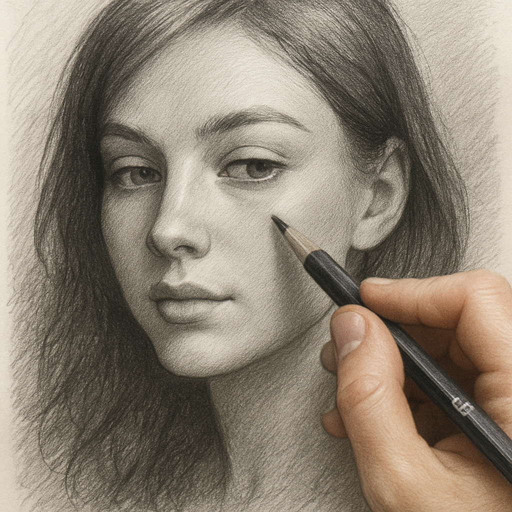
Step 5: Refine Details and Highlights
Now the portrait is looking solid, but you can still feel that something is just a whisper away from truly popping. That’s where the fine‑tuning step comes in – we’ll coax the little details out of the paper and let the light dance across the graphite.
Sharpen the eyes
Ever notice how a portrait can feel lifeless until the eyes catch your gaze? Grab a 4B and a sharp tip. Darken the pupil just enough to anchor the stare, then use a kneaded eraser to pull a tiny speck of white for the highlight. If the iris looks flat, add a faint gradient with a 2B, blending outward in tiny circles. A quick check: hold the sketch up to a light source and see if the eye still reads as a window.
Does this feel intimidating? Not really – a couple of deliberate strokes can turn a sleepy look into a moment that feels like “hey, that’s really them”.
Define hair and fabric
Hair isn’t just black blobs; it’s a rhythm of light and shadow. Switch to a 6B for the deepest troughs, then back to a 2B for the strands catching stray light. Follow the natural growth direction – a few short, angled strokes work better than long, uniform lines. For fabric, think about texture: a smooth shirt gets a soft cross‑hatch, while a knitted sweater benefits from a gentle stipple.
Try this: draw a single hair strand, then duplicate the motion a few times, varying pressure each pass. You’ll see a subtle wave emerge that reads as real hair.
Lift the highlights
Highlights are the secret sauce that tells the viewer where the light hit. Use a clean kneaded eraser and gently roll it over the bridge of the nose, the cheekbones, and the top of the lips. Don’t erase too much – you’re just teasing a glimmer, not wiping the area clean.
Pro tip: shape the eraser into a point for tight spots like the inner corner of the eye. A tiny lift there can make the whole face feel three‑dimensional.
Final touches and fixating
Step back, squint, and ask yourself: does the contrast read like a real face? If a region still looks flat, deepen it with a light 6B press, then blend. If a highlight feels too harsh, soften it with a light smudge of the stump.
When you’re happy, give the paper a gentle dusting of powdered charcoal for an aged, museum‑like patina. Finally, protect your work with a light spray of fixative – a few centimeters away, quick bursts, and you’ve sealed the portrait without fogging the details.
Now you have a finished pencil sketch portrait from photo that feels like a memory you could reach out and touch. Ready to frame it or send it off as a gift? The piece is already speaking its own story – all that’s left is to share it.
Take a quick photo of the finished piece, post it for a friend, and watch the smile spread – you’ve turned a memory into a lasting treasure.
Step 6: Final Touches and Preservation
Now that the graphite has settled into a lifelike face, it’s time for the little things that make a pencil sketch portrait from photo feel finished and last.
First, step back and give your work a good, honest look. Squint, tilt the paper, and ask yourself: does the light‑to‑dark flow read like a real head in a room? If a spot still looks flat, grab a 6B and deepen it just a touch, then blend with the stump.
Next, bring the highlights back to life. A clean kneaded eraser works like a magic wand – roll it over the bridge of the nose, the cheekbones, and the tip of the lips. You’re not erasing; you’re lifting a whisper of white that tells the eye where the light actually hits.
A quick tip many artists swear by: shape the eraser into a tiny point for those tight corners of the eye or the crease between the eyebrow and the forehead. That one‑pixel lift can turn a flat area into a three‑dimensional pop.
Once you’re happy with the values, think about texture. Lightly dust the whole surface with a pinch of powdered charcoal. It adds an aged, museum‑like patina without covering any detail. Just tap the excess off a piece of paper and sweep it across the sketch in a single, confident motion.
Now comes the part most people skip: fixing the piece. A spray fixative is your best friend. Hold the can about eight to twelve inches away, give the paper a few short bursts, then let it dry. The goal isn’t to create a cloud of fog; it’s to lock the graphite in place so it won’t smudge when you frame it later.
If you don’t have a commercial fixative, you can improvise with hairspray. Choose a clear, unscented formula, spray the same short bursts, and let it dry completely. It won’t be as permanent as a professional product, but it’ll buy you a week or two of safe handling.
Speaking of framing, the right mount protects your work and showcases it. A simple wooden frame with a matte mat lets the graphite breathe. Avoid glass that reflects too much light – a non‑glare acrylic sheet keeps the details visible from any angle.
Before you hang it, take a photo of the finished piece in natural light. This not only gives you a digital backup but also lets you share the portrait with friends who might appreciate the sentiment. A quick upload to social media can turn a personal gift into a conversation starter.
So, what’s the final checklist? – Values look balanced? – Highlights are lifted, not erased? – Charcoal dust applied evenly? – Fixative sprayed in light bursts? – Frame chosen with non‑glare protection? Tick each box, and you’ve turned a simple photo into a lasting memory.
And remember, you don’t have to be perfect. A tiny stray line or a slightly uneven blend adds character – it tells the story of a hand‑made piece, not a mass‑produced print. Embrace those quirks; they’re what make a pencil sketch portrait from photo truly yours.
Ready to send it off? Pack the framed sketch in a sturdy cardboard tube, slip a tissue sheet inside for extra cushioning, and include a short note about why you chose that moment. The recipient will feel the love the moment they unwrap it.
That’s it – final touches, preservation, and a little bit of love wrapped up in graphite. Go ahead, display your work proudly or gift it with confidence. You’ve earned every compliment that’s coming your way.
FAQ
What size paper should I use for a pencil sketch portrait from photo?
Choosing the right paper size sets the stage for how detailed your portrait can get. A common sweet spot is 8.5×11 inches – big enough for subtle shading but still easy to frame. If you want a larger statement piece, go up to 11×14 or even 16×20; just remember the bigger surface needs a firmer drawing board and a steadier hand. For a quick test, print a small version of your photo and see how the facial features read at the size you plan to work on.
Do I need special pencils, or will my regular school set work?
You don’t have to splurge on a professional set, but a range of hardnesses makes a huge difference. A soft HB or 2B is perfect for the light‑mid tones, while a 4B or 6B gives you those deep shadows that make a portrait pop. If you only have a standard #2 pencil, you’ll end up with a flat look because you can’t reach the darker values. A simple three‑pencil kit (2B, 4B, 6B) plus a kneaded eraser will cover most needs without breaking the bank.
How can I keep my pencil sketch portrait from smudging after I finish?
Fixatives are the go‑to solution, and you don’t need a fancy spray gun. Hold the can about eight to twelve inches away, give the sketch a few short bursts, and let it dry completely. If you’re in a pinch, a clear, unscented hairspray works surprisingly well – just spray lightly and let it set. Once fixed, you can frame the piece behind non‑glare acrylic, which protects the surface while still letting the graphite breathe.
Can I turn a digital photo into a pencil sketch portrait without drawing it myself?
Absolutely. Services like heartful.gifts let you upload a high‑resolution JPEG and they’ll hand‑draw the portrait for you, then print it on canvas or heavyweight paper. The key is to give them a clear, well‑lit image – the same checklist you’d use for a DIY sketch. Look for sharp eyes, good contrast, and a simple background, because the artist’s interpretation depends on the details you provide.
What’s the best way to capture realistic hair texture?
Hair is all about direction and value shifts. Start with long, light strokes that follow the flow of the strands, then layer darker, shorter marks where shadows pool. Think of each hair as a tiny brushstroke rather than a solid block. A 6B pencil works great for the deepest roots, but keep the pressure light enough that you can lift highlights with a kneaded eraser later. Practice on a scrap piece of paper first – a few minutes of experimenting saves hours of re‑working on the portrait.
How long should I let the sketch dry before framing?
If you used a fixative, give the piece at least 15 minutes to set, though an hour is safer on humid days. Without a fixative, wait until the graphite feels dry to the touch – usually 10‑15 minutes – and then place a sheet of clean tissue between the sketch and the frame backing. This prevents accidental smears while you handle the artwork. When you finally hang it, step back and check that the light hits the highlights; a properly dried sketch will show those subtle lifts clearly.
Conclusion
We made it to the end, and I hope you’re feeling confident about turning any photo into a pencil sketch portrait from photo.
Remember the simple checklist: crisp reference, clean transfer, light outlines, layered shading, and those tiny lifted highlights.
If the eyes don’t pop, grab a 4B, darken the pupil and tease a speck of white – that tiny spark makes the whole face breathe.
A quick fixative spray locks everything in place, so you can frame or mail your gift without worrying about smudges.
And if you’re short on time, heartful.gifts can turn that same photo into a hand‑drawn masterpiece and ship it ready to hang.
The beauty of a pencil sketch portrait from photo is that each line carries a memory, a little imperfection that feels human.
So, what’s the next step? Grab the picture you love, set up a bright workspace, and let the graphite do the storytelling.
Take a photo of your finished sketch, share it with friends, and watch how a simple portrait becomes a treasured keepsake.
Happy drawing, and enjoy the joy of seeing a loved one’s smile frozen in graphite forever.