
How to Create a Personalized Watercolor Travel Map Poster with Step-by-Step Ease
Ever caught yourself staring at a wall, thinking it’s missing something—maybe a story, a spark, a slice of the places that shaped you? You’re not alone. There’s something almost magical about having a visual reminder of the journeys that mean the most to us.
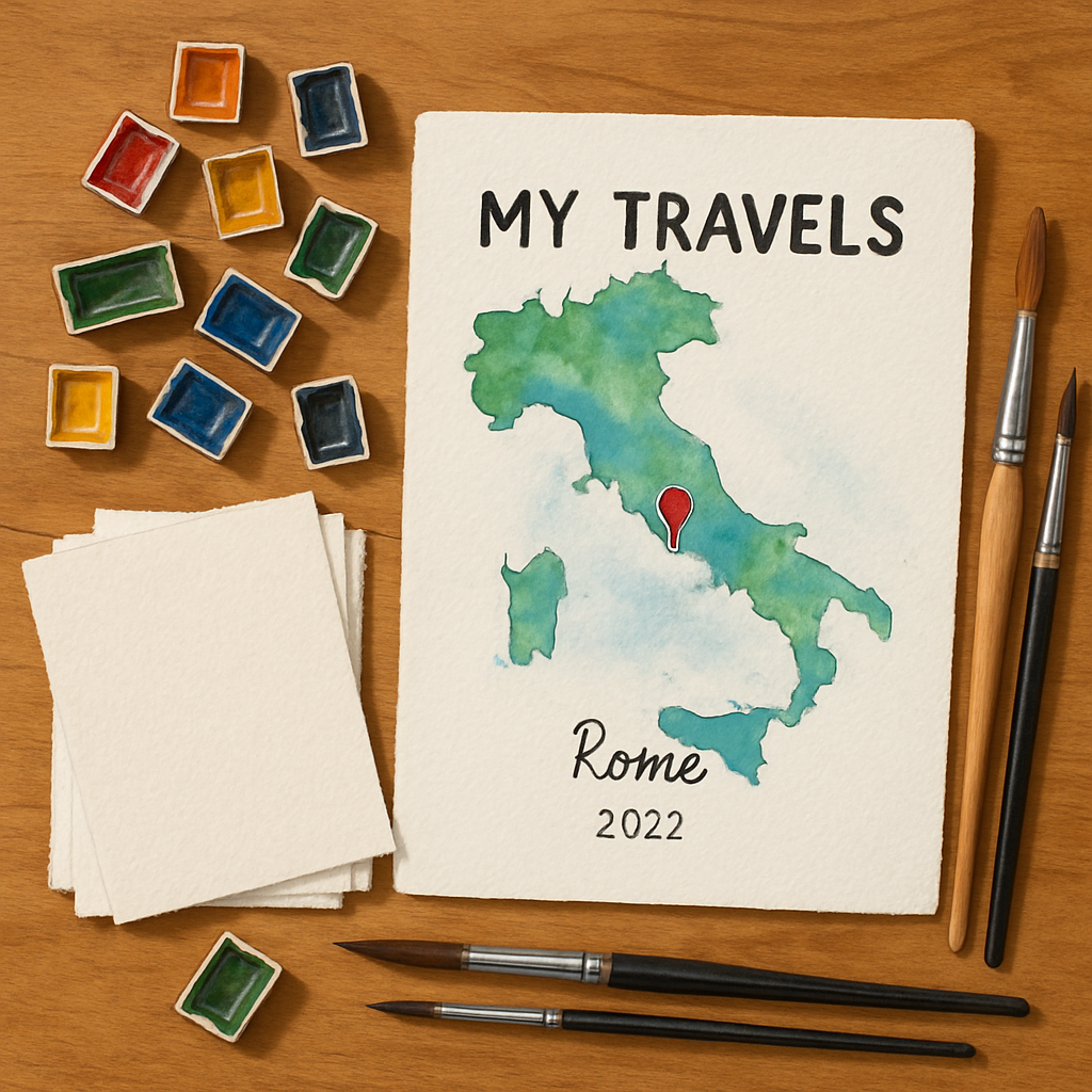
Imagine a piece of art that isn’t just decoration, but a personal map of your travels, rendered in delicate watercolor hues. That’s exactly what a personalized watercolor travel map poster does—it captures those moments, those cities, those winding paths, in a way that feels intimate and vibrant.
But here’s the thing: making one might sound complicated or like a job for a professional artist. What if I told you it’s actually pretty doable, even if you don’t consider yourself crafty? The secret lies in combining your own stories with simple tools and theming it around what truly matters to you.
So, what should you do next? First, think about the travels you want to highlight—was it a family trip that became the backdrop to your favorite memory? A honeymoon marked by new experiences or maybe places where loved ones live that you want to keep close to your heart every day?
We’re gonna walk through how to create a personalized watercolor travel map poster that feels less like a print and more like a love letter to your adventures. You'll learn how to pick the perfect map style, add personal touches, and turn this into a gift or keepsake that’s truly yours.
Also, if you’re a fan of gifting meaningful, customized treasures, you might want to check out our guide on creating meaningful personalized ornaments—another sweet way to hold onto memories.
Ready? Let’s dive in and start crafting something beautiful that tells your story, your way.
TL;DR
Wondering how to create a personalized watercolor travel map poster? It’s easier than you think—start by picking your favorite places, then add your own stories and style to make it truly yours.
This guide breaks down simple steps so you can craft a meaningful keepsake or gift that feels like a heartfelt celebration of your adventures.
Step 1: Choosing Your Map and Gathering Materials
Ever stared at a blank sheet, wondering how to even start your personalized watercolor travel map poster? Trust me, that moment is both exciting and a little intimidating. But here’s the secret: the right materials and a clear map choice will smooth the way like a well-worn path on a favorite hike.
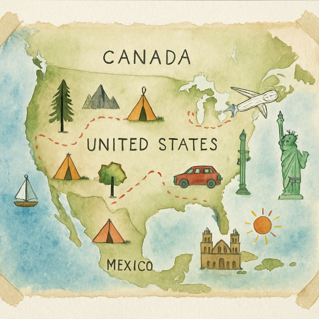
First things first, you need to pick your map. Sounds obvious, but there’s more to it than just slapping a globe or a country outline on paper. Are you showcasing one city where unforgettable memories happened? Or tracing a whole trip across countries or continents? Your choice here shapes everything—size, detail, and even what kind of paper you’ll want to work with.
What kind of map fits your story?
Think about your story. If you’re highlighting a handful of spots—a quaint café in Paris, a beach in Bali, a mountain in Colorado—a close-up city or regional map might be perfect. It lets you zoom in on details and add personal notes right where memories live.
On the flip side, if you’re visualizing a broader adventure—say, a round-the-world trip or a tour through several countries—a map with more space and less clutter works better. It’s like looking at a photo album where each place gets its moment to shine.
And hey, maybe it’s not about places you’ve been, but ones you dream of. That’s cool too. The world’s your canvas, right?
Picking the right paper makes a huge difference
Now, onto the paper. If you want your watercolor poster to pop, don’t just grab any paper off the shelf. Watercolor paper is a different beast from normal drawing paper. Its texture and weight can make or break how your colors blend and dry.
Here’s what matters most:
- Weight: Heavier papers (think 300gsm or more) handle water better, don’t buckle so easily, and feel sturdy. They’re like the comfy shoes you rely on for a long day of walking.
- Texture: There are three common types: hot-pressed (super smooth), cold-pressed (a bit textured), and rough (very textured). Cold-pressed is often a great middle ground for beginners and pros alike, giving your paint a bit of bite without drying too patchy.
- Quality: Artist-grade paper is acid-free and archival, meaning it’ll last and won’t yellow with time. Student-level is cheaper but can be brittle and less vibrant over years.
Don’t get overwhelmed trying to find the “perfect” sheet. Try sampling a few types to see what feels right for your style. For some guidance on this, Jenna Rainey’s detailed take on choosing the best watercolor paper is an excellent read with tons of practical insights here.
Gathering your tools: paint, brushes, and other essentials
While paper is the MVP, your paints and brushes deserve love too. But remember, this project isn’t about owning a million fancy supplies; it’s about choosing quality where it counts.
Good watercolor paint means richer colors and smoother blending. And brushes? Pick ones that hold water well without shedding bristles mid-stroke. You can even find budget-friendly brushes that perform surprisingly well if you’re just starting out.
Of course, you’ll need clean water, mixing palettes, and maybe some masking tape to tape down your paper to avoid warping as you paint.
But here’s a little tip I learned: working on blocks of watercolor paper can save you tons of headaches. Blocks keep the paper securely glued on sides, so you don’t have to constantly tape sheets down or worry about buckling. If you’re going big, loose sheet will give you more freedom but be sure to prepare your workspace accordingly.
Start collecting your travel memories and map details
Before you splash any colors, start jotting down the places you want on your map and the memories that go with them. What landmarks, foods, or adventures stood out? Maybe it’s the cozy bookshop in a small town or the wild hike to a hidden waterfall.
Limiting yourself to 6-14 places is a sweet spot—enough to tell your tale without overcrowding the design. For example, this Etsy personalized travel map poster service lets you add up to 14 places with a memory or two each. It’s a neat way to think about how much you want to include like this.
Also, pick your color scheme early on — maybe you’re drawn to blues and greens that remind you of the ocean, or warm marigolds and rose tones to capture sunset vibes. Setting this now will help keep your map cohesive and heartfelt.
By the way, if you want to add some unique personalized gifts along the way or even inspire gift ideas related to your travel map journey, check out our guide on creative custom wedding gift ideas. It’s all about bringing personal touches into thoughtful presents, just like your map.
So, what’s next? Gather your favorite map style, pick high-quality watercolor paper that speaks to you, and collect your travel memories. Once these building blocks are in place, the next steps feel a lot less scary and a whole lot more fun.
Trust me, the magic of how to create a personalized watercolor travel map poster really lies in laying this solid foundation first.
Step 2: Planning Your Design and Color Palette
Alright, so you’ve gathered your favorite map style and those all-important travel memories. Now comes the part that really sets the tone for your personalized watercolor travel map poster — planning your design and color palette.
This isn’t just about picking pretty shades. It’s where your personality dances with your memories, turning a simple map into something truly yours.
Start with the Feel You Want to Capture
Think about the vibe you want. Is it calm and breezy, like a seaside stroll? Then soft blues and gentle greens might be your pals. Or maybe it’s warm and nostalgic, echoing golden hour sunsets with marigolds and dusty rose.
Here's what I mean: your color palette isn’t just decoration; it’s emotion in pigment. Every hue whispers a story, so don’t rush it.
Try pulling inspiration from your travel photos. Notice the sky’s tone, the color of the streets, the way light hits the scenery. These little details can guide your choices in an unexpected, delightful way.
Keep It Balanced but Bold
Wondering how to not go overboard? Keep it simple. Pick a main color to dominate and two or three complementary colors to support it. For example, a soothing seafoam green balanced with sandy tan and coral accents feels fresh but grounded.
Too many colors can muddy your map, making it hard to focus on those precious locations you’ve traveled. So, lean into harmony—your viewer’s eyes will thank you.
Think About the Paper and Tools
Watercolor paper texture makes a surprising difference. Rough, cold-pressed paper grabs pigment differently than smooth hot-pressed types, changing how your colors show up. Experiment if you can—sometimes that subtle texture is the secret sauce in making your map feel handcrafted somewhere cozy on a rainy day.
And if you’re juggling digital and traditional methods, tools like Adobe Illustrator offer nifty 3D effects to add depth and dimension to your map’s design. Just be mindful not to lose that organic watercolored look in the process. For a quick primer on blending traditional art with digital touches, check out this useful watercolor techniques video.
So, how do you bring harmony between your design and materials? Layer your colors mindfully and don’t hesitate to test small swatches before committing. This gentle trial and error saves headaches later.
Highlight Key Places with Style
Want your favorite cities, landmarks, or routes to pop? Consider using a contrasting color or a slightly different brush technique around those areas. Maybe a small splash of brighter pigment or a delicate gold ink outline.
This is where your creativity really gets to shine, but don’t forget less is more. Even subtle differences can guide your viewer’s eyes right where you want them.
Final Tip: Keep It Personal and Playful
At the end of the day, this map is your story. If your palette doesn’t feel quite right, adjust it. If the design seems stiff, loosen it up.
And if tech stuff feels intimidating, remember you’re not alone. Plenty of artists share helpful tutorials like the Adobe Illustrator 3D effects guide to show how to add dimension without losing charm.
With your design plan and colors set, you’re ready to make a map that’s not just a keepsake, but a heartfelt piece that invites you to relive every adventure, one brushstroke at a time.
Step 3: Painting the Map Base and Important Details
Alright, now the fun really begins. Painting the base of your map is kind of like laying down the first layer of frosting on a cake — it sets the stage for everything else. Without a smooth, thoughtful foundation, the details won’t pop the way you want them to.
Start by thinking about the overall vibe you want. Are you aiming for soft and dreamy pastels that whisper memories of sandy beaches? Or maybe bold, vivid washes that shout adventure? Whatever it is, get your watercolor palette ready and test your colors on a scrap piece of paper first. This little step can save you from some real regrets — trust me, I’ve been there.
Begin applying broad washes to stamp the main landmasses and bodies of water. Don’t overthink every stroke here; think about the natural flow of watercolors blending on paper, the way pigments pool and fade. This organic randomness adds a charm that digital maps just can’t touch. Lightly wet your paper first with clean water in the areas you’ll paint the base colors—this way, your colors will bloom and spread beautifully, giving you that signature watercolor softness.
As you're filling in the base, keep an eye on your paper’s texture showing through. That little grit is like breathing life into your map. And yes, imperfections here are actually a win — they make it feel handcrafted.
Now, onto marking the important stuff. Here’s where your map starts telling a story. Use a finer brush to outline coastlines or mountain ranges that you want to highlight. But gentle does it — too harsh a line and you lose that watercolor magic. If you want to get fancy, layering a few thin lines can create depth without looking stiff.
Don’t forget about key destinations — cities, landmarks, or routes that hold special meaning. You might want to dab a slightly more saturated color, or even a tiny dot of metallic paint, just to catch the light. It doesn't have to be loud, just a little wink that says, "Hey, this place means something." This technique is popular among watercolor artists, as seen in detailed tutorials like the ones from this watercolor map guide.
Feeling overwhelmed about how much detail to include? Here’s a little secret: less is definitely more when working with watercolor. Too many tiny elements can turn your map into a muddy mess. So pick your favorite highlights and give them room to breathe.
At this point, you might be wondering how to blend colors seamlessly so those edges don’t look harsh. A handy trick is to work wet-on-wet; that’s painting onto damp paper or over still-wet paint. This helps colors gently melt into each other — no sharp lines, just dreamy gradients. There’s some talented artists sharing step-by-step videos online, like this tutorial demonstrating wet-on-wet techniques, which can really boost your confidence.
Remember to let each layer dry before adding new details. Watercolors can be unpredictable if you rush, and reactivating previous layers might blur those crisp little dots and lines you’ve so carefully placed.
And hey, don’t stress about perfection here. This is your map, your memories captured in color. Every brushstroke, intentional or happy accident, makes it unique. If something looks off, step back, take a breath, and maybe add a soft wash over it to blend things out.
By the time your base and important details are painted, you’ll start to see the essence of your journey unfold right on the paper. It’s not just a map anymore; it’s a one-of-a-kind story, ready for the personal touches next.
Ready to keep going? The next step is all about layering in small accents and textures that make your watercolor travel map poster truly pop. But take your time here — soaking up the process is half the joy.
Step 4: Adding Personal Touches and Custom Elements
Alright, so you’ve got your base map and some lovely details down—now it’s time for the magic part. This is where your watercolor travel map poster becomes *yours*—the place where memories leap off the paper, and not just a pretty picture on the wall.
Have you ever noticed how the little quirks really make something feel personal? Maybe a tiny doodle marking a favorite café, or some handwritten notes in the margins. Same idea here, but with watercolor and a sprinkling of your creativity.
Start Small: Accent Details That Speak Volumes
Think about adding subtle textures or accents to highlight places that mean something special to you. For example, you could use a fine brush or a thin marker to sketch small symbols like a heart, a star, or even tiny footprints next to cities you visited. It’s these little markers that turn your map into a storybook.
Along those lines, layering in tiny watercolor dots or washes around landmarks can give your map a sort of glow or emphasis without crowding the beauty of your base painting. If you want some inspiration, check out creative layering techniques like those shared in this DIY Hawaiian Island Map tutorial. It’s a fantastic example of how color, texture, and tiny flourishes bring a map to life.
Make It Yours with Custom Borders and Edges
Ever thought that your map’s edges could tell a story too? You’re not limited to clean, straight borders. Why not try creating torn or deckled edges using washi tape, or softly brushing the edges with a hint of color? It adds a tactile, vintage vibe that says, “this map has traveled” alongside you.
And hey, you don’t have to be a pro calligrapher to add handwritten touches. Using a waterproof pen, jot down the dates of your visits, memories tied to locations, or even quotes that make you smile when you think about the trip.
Custom Elements: Mixing Media to Elevate Your Map
Here’s where you can get a bit wild—in a good way. Combining watercolor with other supplies like ink, colored pencils, or even salt sprinkled over wet paint can create fascinating effects. Yep, that salt trick sprinkles a kind of unpredictable texture that looks like glistening waves or sandy beaches on your map’s water areas.
If you’re curious about these techniques, there’s a whole world of map customization out there, including digital style tweaks if you’re working with digital files. For example, developers often customize maps’ appearance using JSON styles to hide or highlight specific features, letting your map focus only on what you want to showcase. Check out this guide to styling maps with JSON for some tech-savvy inspiration.
Don’t feel overwhelmed. The key is to pick just a few custom touches that feel meaningful. You want your poster to speak, not shout.
So, what should you do next? Grab some of your favorite art supplies—maybe a fine-tip pen, some colored pencils, or a little salt—and think about moments from your travels that you want highlighted. Jot them down, sketch them in lightly, and slowly build your personal story onto the map.
Remember, how to create a personalized watercolor travel map poster is all about capturing more than just geography—it’s hugging your memories tightly, framed in color and texture that no one else could replicate.
| Feature | Option/Tool | Notes |
|---|---|---|
| Accent Details | Fine brush, waterproof pens, watercolor dots | Add symbols or marks for special locations—creates a story |
| Custom Borders | Washi tape, torn edges, soft color washes | Gives a vintage or tactile feel; frames the map creatively |
| Mixed Media Effects | Salt over wet watercolor, colored pencils, ink | Enhances texture and depth; salt adds unique patterns on water |
Step 5: Protecting, Framing, and Displaying Your Poster
So, you’ve poured your heart into your watercolor travel map poster. Now comes the moment that often feels a bit daunting: how do you keep that beauty safe without smothering it?
Let’s be honest. Watercolor is delicate. It’s vibrant but vulnerable— prone to fading under sunlight, smudges from curious fingers, and the ever-evil dust and moisture. But don’t worry, protecting it isn’t rocket science; it’s about smart choices and a gentle touch.
Seal it to Save it
Imagine this: You’ve spent hours layering colors and adding personal details, only to see those colors dull or blur over time. That’s where sealing your artwork steps in. A good fixative or varnish spray acts like sunscreen for your poster, shielding the pigments from UV rays and environmental damage. Just make sure your poster is completely dry first— rushing it can lead to streaks or sticky spots.
Two light coats are usually enough. Too much varnish and your poster might turn glossy or lose that soft watercolor charm. Matte sprays are fantastic if you want to keep it natural-looking, while gloss can make those colors pop if that's your vibe. Check out this detailed guide on how to seal watercolor paintings effectively for insider tips and brand recommendations.
Choose the Right Frame (And Glass)
Here’s a thing most folks overlook: the glass or acrylic protecting your poster doesn’t just prevent touchy mishaps; it also blocks UV rays. But not just any glass—UV-protective or museum-grade glass is your poster’s best friend, keeping colors vibrant for years to come.
And acrylic frames? They’re lighter and more shatter-proof than glass, which is great if your poster lives in a high-traffic area or you plan to move it around.
If you want the full low-down on framing watercolor art and why UV protection matters so much, this video from a seasoned artist explains it all in clear, no-nonsense terms.
Display Tips to Keep Your Poster Happy
Think about where your poster will hang. Direct sunlight is a no-go—it’s like leaving your art out in the rain but slower and sneakier. Spaces with consistent humidity and temperature help too; sudden swings can make paper buckle or paint crack.
Backing your framed poster with acid-free mat board also preserves color vibrancy and prevents the paper from yellowing. If you want a quick win, these mat boards are easy to find at craft stores, and they’re a game changer over time.
And hey, if you’re storing your poster before deciding where it goes, keep it flat and wrapped in acid-free glassine sheets to block out dust and moisture.
By taking these steps, you’re not just framing a pretty picture — you’re preserving a story, your story. A little care now means your personalized watercolor travel map poster stays a beautiful treasure for years to come.
Want to explore more about keeping watercolor artwork fresh and vibrant? This comprehensive resource shares expert advice on sealants and sprays, while this artist video breaks down framing tips that are perfect for any beginner.
Conclusion
So, here we are—at the end of our journey on how to create a personalized watercolor travel map poster. It’s kind of amazing, isn’t it? How a simple piece of paper with paints and memories can hold the weight of so many adventures and stories just waiting to be remembered.
We’ve walked through the why and the how, from picking the right map to making sure your watercolor masterpiece stays vibrant for years. And honestly, that little extra care—like avoiding direct sunlight or using acid-free materials—makes all the difference. Think about it: this isn’t just wall art. It’s a keepsake that brings your favorite places back to life every time you glance at it.
Does this really work? Absolutely. You don’t need to be a pro artist to create something that feels personal and heartful. The beauty is in your story, your travels, your memories mapped out in a way that speaks to you.
So, what’s next? Grab your supplies, or browse for a custom print on a site like heartful.gifts, and start turning your favorite places into a stunning watercolor poster. Your walls—and your heart—will thank you.
Frequently Asked Questions about Creating Personalized Watercolor Travel Map Posters
So, you’ve thought about making your own watercolor travel map poster but still have a few questions buzzing in your head? You’re not alone. It’s totally normal to pause and wonder about the nitty-gritty before diving in.
What materials do I need to create a personalized watercolor travel map poster?
At first glance, it might seem like you need a ton of fancy supplies. But honestly, the essentials boil down to good quality watercolor paper, a basic set of watercolor paints, some brushes, and your chosen map. Oh, and don’t forget a pencil for sketching your design!
If you want it to last, grabbing acid-free paper is a game changer. It keeps your colors fresh and paper from yellowing over time. Pretty important for a keepsake that’s meant to hang around.
Do I need to be an artist to create a beautiful poster?
Nope. Really, you don’t have to be the next Picasso. The charm of these posters lies in their personal touch, not perfect brush strokes. Think of it like handwriting a letter instead of typing it.
Some people use stencils or digital maps as bases, then add their own watercolor flair on top. It’s all about your story, not the technical skill.
How can I choose the right map for my poster?
This one’s a bit personal. Do you want a world map, a country, or maybe just a city where you had the best coffee? Picking a map that sparks your memories is key. You might even combine places you’ve been with spots you dream about visiting someday.
And if you’re ever stuck, there are plenty of customizable map templates online that let you fix colors and details till it feels just right for you.
What’s the best way to preserve the colors and paper?
Watercolors can fade, especially if you leave your poster in direct sunlight. So, hang it somewhere cozy, away from windows that catch the sun’s harsh glare. Using a UV-protective frame also helps.
Store the poster flat if you’re not displaying it right away. Acid-free sleeves or portfolios keep dust and moisture at bay.
Can I make these posters as gifts, and are they appreciated?
Absolutely. These posters make heartfelt gifts for loved ones who share your wanderlust or have a collection of shared travels with you. Unlike generic gifts, they carry stories and memories—things that don’t just sit on a shelf.
Imagine gifting your partner or parent a map highlighting all the places you’ve been together. It’s a way to say, "Hey, I remember these moments with you." That kind of personal touch? Priceless.
Are there digital tools that can help me create the map before painting?
Yes, if you’re more into mixing digital and traditional methods, tools like Inkarnate or even simple map screenshot apps can help lay out the geography. You can print those out lightly as a guide before adding your watercolors.
Just remember, the charm is in imperfections and your personal style—don’t stress about making it look like a map app.
Wondering where to start? You might find inspiration and templates at heartful.gifts, perfect for turning your travel memories into art you can hold.