
How to Create a Personalized Watercolor Travel Map Poster: A Step-by-Step Guide
You know that feeling when you stumble upon an old suitcase packed with souvenirs from trips you almost forgot? Each item whispers stories—places you've loved, adventures you've had, memories that shaped you. What if you could capture that magic in a piece of art that speaks just to you or someone you care about?
That’s exactly why learning how to create a personalized watercolor travel map poster is such a game changer. It's not just about a map; it's about turning your favorite journeys into a snapshot of emotion and beauty. Think of it as framing your travel story with soft, dreamy colors and personal touches that make it uniquely yours.
But maybe you're wondering: how do you even start? It might feel a little intimidating at first, like trying to catch a sunset with a paintbrush. And honestly, that’s where the charm lies—each map becomes a personal masterpiece, not a cookie-cutter print off some shelf.
We’re about to dive into a simple, step-by-step guide to making your own watercolor travel map poster that feels handcrafted, heartfelt, and full of stories. I’ll walk you through picking the right places, choosing colors that mean something to you, and adding those special details that make the art yours or your loved one’s. It’s easier than you think, and so worth it.
Wondering why a watercolor style? Well, it captures the softness and fluidity of travel memories—the way places and experiences blend in our minds, sometimes vivid, sometimes fading, but always beautiful. Plus, it adds that lovely handmade feel without needing a degree in painting.
Ready to create something meaningful that can hang on your wall and spark joy every day? Let’s get started on this creative journey. And if you want inspiration from other unique personalized gifts, check out our guide on how to create a personalized watercolor travel map poster with step-by-step ease. It’s packed with warm tips and easy ideas that feel like chatting with a friend over coffee.
TL;DR
Want to create a personalized watercolor travel map poster that’s truly yours? It’s easier than you think: pick meaningful places, choose colors that speak to your memories, and add special details that tell your story. By the end, you’ll have a unique, heartfelt piece of art to cherish.
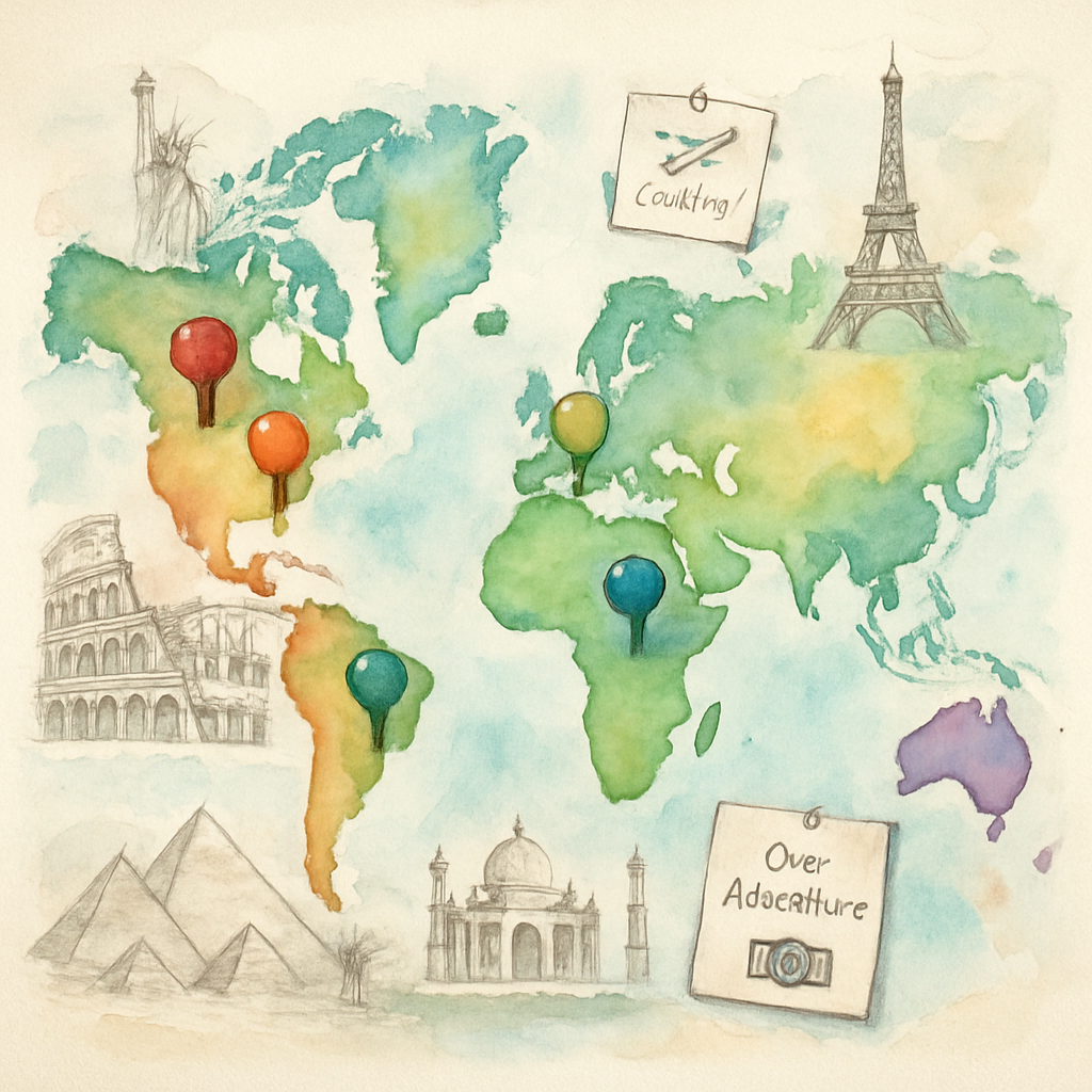
Step 1: Choose Your Travel Destinations and Gather Inspiration
Ever find yourself staring at a blank map, wondering where to even begin? Yeah, I’ve been there. Choosing which places to highlight on your personalized watercolor travel map poster can feel overwhelming—because every spot you pick holds some kind of story or feeling, right? It’s like deciding which chapters of your favorite book to reread again and again.
But here’s the thing. This step isn’t just about geography; it’s about what moves you. Which places make your heart skip a beat? It’s these spots that will transform a pretty map into a vibrant memory collector.
Start with What Feels Most Meaningful to You
Think about those moments that stick with you—whether it’s the small beach town where you finally relaxed, that buzzing city where you fell madly in love, or just your hometown that grounds you. Don’t rush this part. Grab a cozy spot with a cup of coffee or tea, and sift through your travel memories.
Maybe you have photos from trips, souvenirs, or just mental snapshots of places that defined a season in your life. Jot them down or keep a running list on your phone. You might be surprised which ones actually spark joy, or a rush of nostalgia.
Use Tools Like Google Maps to Visualize Your Spots
If you’re feeling scattered, digital tools can be a lifesaver. With Google Maps, you can actually drop pins on all your favorite places and get a sense of how they link together. You can even add notes or photos to each pin — perfect for keeping track of those little details that make a location unique to you.
Allison Jeffers, a talented photographer, swears by this method for organizing trips and memories alike. She shares a great tip for making custom maps on Google that can easily translate into inspiration for your watercolor poster in her detailed tutorial. Her approach makes planning feel less like a chore and more like storytelling.
Collect Inspiration from Artistic Sources
It’s easy to get lost in the technical side, but don’t forget to soak in some inspiration. Browse Pinterest boards, Instagram artists, or watercolor art pages and notice what style or mood grabs you. Are the watercolors soft and dreamy or bold and vibrant? Do the maps mix landmarks with whimsical elements or keep it minimalist?
This kind of research not only fuels your creativity but gently steers you towards the kind of watercolor poster you’ll love living with. Want to go a step further? Check out some insider tips on selecting watercolor supplies and paper that really bring your travel story to life from well-known artist Jenna Rainey, whose insights can help you decide the kind of surface your artwork might need right here.
Balance Your Dream List with Practical Choices
Got a billion places you adore? It’s okay. But remember, too many pins can get cluttered on a map or poster. Try narrowing down your list by asking yourself: Which destinations have the strongest stories? Which ones do you think about first when someone asks, “Where have you traveled?”
If you have a mix of local spots and far-flung adventures, that’s cool too. The magic is in how these places connect your personal journey. Even a neighborhood coffee shop that felt like home can have a place on your map.
Ready to Turn Inspiration into Artwork?
Once you’ve got your curated list, take a moment to picture how these places will appear in watercolor form. Don’t worry about perfect details just yet; this is about capturing the spirit behind each destination.
And something I’ve learned? The selecting phase is as much about feeling as it is about planning. So if a spot makes you smile or stirs a sense of adventure, it’s probably a keeper.
Now that you’ve gathered your travel destinations and sparked some inspiration, you’re one big step closer to creating a personalized watercolor travel map poster that isn’t just a map, but a scrapbook of your heart’s journeys.
So, what should you do next? Start pinpointing those places using tools you’re comfortable with, sketch a rough list, and maybe—just maybe—pull out a blank sheet and play around with colors or shapes that remind you of each location. It’s fun, and it sets a fantastic foundation.
Step 2: Select the Right Materials and Tools for Watercolor Painting
Okay, here’s where the fun—and maybe a little head-scratching—begins. Picking out materials for your personalized watercolor travel map poster can feel like standing in front of a candy store and not knowing what to choose. Brushes, paper, paints—there’s a whole world of options waiting for you, and yeah, it can get overwhelming fast.
But don’t worry. I’m not going to drown you with every single tool out there. Instead, let’s strip it down to what really matters and what you’ll actually use.
Watercolor Paper: Your Canvas Matters More Than You Think
Think of the paper as the stage where your travel memories perform. Not all paper is created equal here. You'll want to start with 100% cotton watercolor paper if you can. It soaks up the paint beautifully and holds up well to layering and washes without buckling the way cheaper papers do.
Look for heavyweight paper—think 140 lb (300 gsm) or more. This thickness keeps everything flat and happy while you paint. And if you want to get fancy, cold-pressed paper is your best friend. It’s got a nice mid-texture that’s forgiving for beginners and adds just enough character to your map.
Pro tip: Ditch flimsy sketch papers for this project. The rougher texture of watercolor paper helps the pigment sit perfectly, which is kind of the whole point.
Paints: Tubes, Pans, or Sets? What’s Right for You?
Now, when it comes to paint, you might be tempted to grab the biggest, fanciest set you can find. But here’s something real: You don’t need to break the bank to start painting something special. A few carefully chosen colors will do the job just fine.
Travel map posters are about combining soft washes and detail. So having a good palette of blues for oceans and skies, greens and browns for landscapes, and a splash of bright colors for landmarks will work wonders.
Many artists swear by tubes for their vibrancy and mixing flexibility, but pans are more portable and less messy if you're working in smaller spaces. It’s a personal thing. Try both and see what feels right.
Your Brushes: Just a Few with Big Impact
Alright, brushes—the real wild card. I remember stepping into an art store for the first time and being overwhelmed by every brush shape, size, and brand out there. Round, flat, dagger... it felt like learning a new language.
Here’s the deal though: You only really need a couple of trusty brushes to get started. A round brush size 6 or 8 is a great all-around choice. It handles detail just fine but still covers a decent amount of space. Then, if you want, add a flat brush about 1/2 an inch wide. Flat brushes help with bold strokes and creating those sharp edges —think border lines or a city skyline silhouette.
When it comes to the type of brush, synthetic or synthetic sable brushes are excellent for beginners and even seasoned painters. They hold water well and keep their shape, making your strokes more predictable. Plus, they’re friendlier on your wallet than pure sable brushes.
If you’re curious about specific recommendations, Susan Chiang’s beginner brush guide breaks down exactly which brushes work best without drowning you in options. It saved me from buying a dozen brushes I never used.
And quick heads-up: those plastic water brushes with built-in reservoirs might sound perfect for on-the-go painting, but they don’t replace real watercolor brushes for projects like your travel map poster. They’re cooler for sketching or lettering, but keep them as a bonus tool rather than your main brush.
Extras That Make Life Easier
Don’t forget about some trusty extras: a mixing palette (or even a simple ceramic plate works), a container for fresh water, and a few paper towels for blotting and fixing mistakes.
Before you dive in, tape your watercolor paper to a flat surface—this prevents it from warping as it dries and gives you clean edges for your poster. It’s a small step but really pays off in the end.
Feeling better about your gear? Remember, knowing your tools is half the battle when learning how to create a personalized watercolor travel map poster. Once you have the right materials in your hands, the rest naturally falls into place.
Still feeling a little shaky on exactly how to use these brushes and paints together? Check out this video where watercolor techniques come alive—think of it as a gentle nudge to get you started:
So, what’s next? Head out or online, grab a small set of quality brushes, some cold-pressed 140 lb watercolor paper, and a few paint colors you love. Give yourself the freedom to play, to mess up, and watch as your personalized watercolor travel map poster starts to take shape—one brushstroke at a time.
Need a little inspiration on mixing colors or choosing brands? Here’s a great overview of watercolor brushes perfect for beginners, and if you want to dig deeper into paper types and paint quality, this artist’s guide to watercolor materials is a fantastic read.
Ready to dig in? Don’t overthink the gear. Pick up a few solid basics, and just start painting your story.
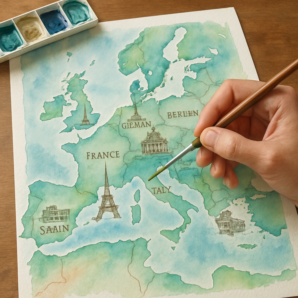
Step 3: Sketching the Map Layout and Important Landmarks
Here’s where the real fun begins. You’ve gathered your brushes, your favorite paints, and that dreamy watercolor paper ready to catch your story. But before lifting a brush in full color, you’ve got to sketch out the map layout. Think of it as the blueprint for your adventure—it sets the stage and guides every brushstroke that follows.
Don’t rush this part. Starting with a loose pencil sketch gives you the freedom to play around with placement without second-guessing yourself later. Grab a soft pencil—something like a 2B—and lightly trace the basic shape of the area you’re mapping. Whether it’s a city skyline, a cluster of islands, or a winding road, keep your lines gentle and sketchy. You can always darken or erase them as you go.
Outline the Map Boundaries
Begin with the broadest strokes: map boundaries. Imagine you’re framing a picture—this frame sets your entire composition. It helps to think of this space like a stage where your landmarks are the stars.
Here’s a tip—I like to use faint grid lines on the paper as a guide. It sounds fancy, but you simply draw light vertical and horizontal lines to help keep everything in proportion. This little trick can save you from scrambling when a landmark looks oddly placed or your coastline bends the wrong way.
Pinpoint Your Must-Have Landmarks
Now, the juicy bits: landmarks. These aren’t just dots on a map—they’re the moments that made your trip unforgettable. The quirky café with the best coffee, that hidden beach where time paused, or the towering monument you couldn’t stop staring at. Jot these down and think about how big or small you want them to appear in your painting.
Wondering how detailed you should get? Keep it simple but meaningful. A rough shape of a mountain or a sketched lighthouse silhouette may communicate more charm than a perfectly precise rendering. The goal isn’t accuracy but capturing the essence.
Balance and Flow Matter
Don’t scatter your landmarks without a thought. Ask yourself: Does the map flow naturally? Can the eye travel easily from one spot to the next? If not, adjust your layout. Sometimes grouping landmarks in clusters tells a better story. Other times, leaving some breathing room makes the individual elements stand out.
This sense of balance keeps your watercolor travel map from feeling cluttered or confusing. It’s like chatting with a friend and sharing your highlights—some pauses and spacing make the story more enjoyable.
Adding Roads, Rivers, or Paths
These are the connectors, the invisible threads weaving your tale together. A winding road, a meandering river, or a dotted trail—it’s all about guiding the viewer’s eye and hinting at the journey you took.
Don’t worry if your paths aren’t perfect curves. The charm of a hand-painted map is in its imperfections. Let your pencil line breathe and flow. Sometimes, a gentle waviness adds more life than a rigid line ever could.
Keep Light and Shadow in Mind
If you’re curious about adding subtle depth to your sketches, here’s a gentle nudge from art fundamentals: pay attention to where your light source would be. Sketching shadows or lighter sides on landmarks helps once paint hits the paper. It’s like prepping the stage for your watercolor drama. For a quick guide to how light and shadows behave in drawing, Will Kemp’s beginner’s guide to light and shadow explains it beautifully.
Keep your pencil marks soft and don’t press too hard. You want the sketch to support your paint, not compete with it.
Don’t Forget to Keep It Personal
Remember, this is how to create a personalized watercolor travel map poster, so let your favorite memories dictate what gets featured. Sometimes a small note or a heart shape near a spot can add a sweet touch of meaning. You might even jot a date or a short phrase—the kind of personal flair only you can bring.
Not sure how to tie it all together after your sketch? Take a peek at this step-by-step guide to creating a personalized watercolor travel map poster. It’s packed with practical advice on transitioning from sketch to paint with confidence.
So don’t sweat perfection. This map is your story, slightly messy and perfectly yours. Grab your pencil now, sketch loosely, and watch how your watercolor travel map begins to take shape—one cherished landmark at a time.
Step 4: Painting Techniques to Bring Your Watercolor Map to Life
Alright, let's talk about that moment when your pencil sketches meet paint—where your map really starts to breathe. You know that feeling, that tiny burst of excitement mixed with a bit of nervousness as the first splash of color hits? That’s where the magic begins.
Painting a personalized watercolor travel map isn’t about perfection, but about capturing your stories with color and texture. So, grab your brushes and let’s get into some techniques that’ll make your map pop without turning it into a crowded mess.
Start Soft: The Wash Technique
Think of a wash like the background music of a party — it sets the mood without stealing the show. Start with a large, soft brush and lightly wet the area you want to paint. Then, add watered-down color to create a gentle, even base. This works wonders for oceans, parks, or the subtle shades that mark different regions.
Why does this matter? Because a well-executed wash sets a calm, airy stage for the details, and it helps your map feel cohesive without screaming "look at me!"
Build Layers, Don’t Rush
Ever noticed how a great story usually unfolds one chapter at a time? Your watercolor map should be the same. Let each layer dry completely before adding the next. This way, you avoid muddy colors and keep things crisp.
Start with light tones and gradually add deeper shades to create depth—like painting the gentle slope of a mountain or the shadows in city streets. Patience here pays off big time.
Use Dry Brush for Texture
Now, here’s a trick you might not expect. When you load your brush with paint but wipe off most of the water, then lightly drag it over the paper, it creates a broken, textured line. It's perfect for things like rough coastlines, tree lines, or old cobblestone paths.
This technique adds character and a handmade feel, so your map looks less like a print and more like an adventure you lived through.
Tip: Mix Your Colors on Paper, Not Just the Palette
Instead of blending everything on your palette, let colors mingle right on the paper. Drop a couple of shades next to each other while the paint is still wet and watch what happens. That subtle shift—from turquoise to green or gold to amber—adds a lively spontaneity that’s hard to fake.
It’s a bit like letting your memory surprise you—the way sunlight flickers through branches or streets look different depending on the hour.
Reserve Whites and Highlights
Here’s a little secret: leaving parts of your paper untouched is just as important as painting them. Those blank spaces become highlights—like sunlight reflecting off a river or the glimmer of a landmark.
If you’re worried about missing spots, try using masking fluid to protect areas you want to keep white before you paint the wash. That way, you don’t have to rely on a white pen later, which can sometimes feel less natural.
Adding Personal Details with Fine Brushes
Got a tiny heart to mark a special place? Or maybe a note like “That bakery with the best croissants”? Use a small, fine-tipped brush to add these accents once the base layers are dry. It’s these personal touches that turn your map into a heartfelt story.
Remember, less is more here. You want these details to invite curiosity without overwhelming the whole picture.
What about mistakes?
Look, watercolor is forgiving but also unpredictable. One minute you’re gently layering colors, the next—oops! A spill or a blotch. No biggie. You can lift some paint gently with a damp brush or a paper towel, or even incorporate the “mistake” into your landscape as a shadow or weathered patch. This makes your map a living piece of art, not just a flat reproduction.
If you want to see these painting techniques in action, this watercolor map tutorial video breaks down how to bring maps to life with painting in a really approachable way.
And if you’re curious about making your base map look even more artistic before you paint, this guide on turning an ArcGIS basemap into a watercolor basemap offers some cool insights that might spark your creativity.
Does this really work? Absolutely. Many artists find that these simple techniques help create a map that feels alive, personal, and just a little bit magical.
So, what should you do next? Play with washes, layer patiently, and don’t be afraid to let your brush dance with some dry strokes here and there. Remember, your watercolor map is a celebration of your journey—and your painting technique should be as unique as the memories it marks.
Step 5: Adding Personal Touches: Lettering, Icons, and Details
There’s something undeniably charming about maps that tell your story in their own voice. Adding personal touches like lettering, icons, and delicate details isn’t just decoration—it’s how your watercolor travel map poster becomes a reflection of your journey, not just a picture of places.
So, how do you start making these touches feel natural and heartfelt?
Hand Lettering: Your Map’s Personality
Maybe you’ve noticed how those hand-lettered titles and place names on maps pull you in more than typed fonts. They bring warmth, personality, and a hint of nostalgia.
If you’re nervous about your handwriting, don’t worry—perfection isn’t the goal. A bit of imperfection makes it relatable, like a note scribbled on a postcard.
Try using a fine brush or a nib pen dipped in watercolor or ink. Test on scrap paper first to find your rhythm.
Want a simple trick? Use pencil to lightly sketch your lettering before going over it with paint or pen. It helps keep your words flowing without feeling rigid.
Pro Tip
For a subtle vintage vibe, pick a classic script or block letter style that matches the mood of your map. If you want to get inspired, artists often look to hand lettering examples and exercises on Pinterest for fresh ideas.
Icons and Symbols: Small Images with Big Meaning
Icons are like secret codes that add layers of meaning to your map. Think of tiny symbols for landmarks, your favorite coffee spots, or places where memories were made.
You don't need to be a graphic designer to create simple icons. Start with basic shapes—stars, hearts, tiny mountains, or waves.
Keep icons consistent in style and size to maintain harmony. And don't overdo it; too many details can clutter your beautiful watercolor work.
Wondering what icons to use? Consider what moments or features you want to highlight. Is it breezy beaches, cozy cafes, or vibrant city streets?
Where to Find Inspiration
For guidance, you might explore public domain map icon collections or check out how icons are used in apps and online maps. While Google Maps doesn’t provide a public key for its icons, seeing community discussions on map icon meanings can spark your creativity.
Adding Details That Tell Your Story
This is where your watercolor travel map poster sings with life.
Details can be anything from waves along the coast, tiny trees dotting forests, squiggly lines marking hiking trails, or small doodles of your favorite meals from a trip.
Don't stress over scale or absolute accuracy—it’s more about feeling than exact geography here.
Try layering these elements lightly so they don’t overpower your base map. Paint with a dry brush for texture or dot details with a fine point.
Adding small captions or notes beside these details lets you whisper the story behind each one—a little prompt that makes the map personal and memorable.
Remember the Rule of Balance
Too many personal touches can overwhelm the artwork, but too few can leave it feeling bare.
After adding your lettering, icons, and details, step back. Does it feel like your journey on paper? Is there enough breathing room or did you cram in too much?
The beauty of making a personalized watercolor travel map poster is that you get to decide the balance. It’s your story.
| Feature | Option/Tool | Notes |
|---|---|---|
| Lettering Style | Fine Brush or Nib Pen | Imperfect, hand-drawn lettering adds charm; sketch lightly first |
| Icons | Simple Shapes (stars, hearts, mountains) | Keep consistent size and style; highlight meaningful spots |
| Details | Dry Brush Techniques, Fine Points | Add textures like waves, trees, or trails; small captions personalize further |
Want to see how artists layer and detail watercolor maps? This watercolor map tutorial video breaks down the process beautifully, showing how details bring maps to life without losing their softness.
Also, if you’re inspired to turn your base map into an artistic canvas before adding personal touches, this guide on transforming ArcGIS basemaps into watercolor style offers practical ideas to jumpstart your creativity.
So, what should you do next?
Start small. Pick a few key spots to letter by hand. Sketch a few simple icons that mean something to you. Then add tiny details that whisper the essence of your travels.
Don’t overthink it. Your watercolor travel map poster is a living story, one that grows with layers of your personal touches. Go ahead, make it yours.
Step 6: Finishing, Framing, and Displaying Your Travel Map Poster
You’ve poured your heart into crafting a beautiful watercolor travel map poster, layered with memories and personal touches. But now what? Leaving it sitting loose or unfinished can feel like tossing a masterpiece into a drawer. Finishing and framing your poster transforms it from a simple keepsake into a cherished piece of art that grabs attention and sparks conversations. Let’s walk through how to give your creation the perfect send-off.
Choosing the Right Finish to Preserve Your Art
First things first: protecting your watercolor work is key. Watercolors can be delicate, and over time, light and dust can dull those vibrant washes you carefully painted. You’ll want to consider a protective finish that won’t mask the soft textures and subtle hues.
Many artists swear by a clear, acid-free fixative spray. It’s like sunscreen for your art—imperceptible but shielding it from UV rays and smudges. Just remember to spray in thin, even layers, preferably outdoors or in a well-ventilated room. Take your time. Too heavy a coat can muddy colors, and that’s the last thing you want.
Or maybe you’re more into mounting your poster onto a sturdy backing board. This prevents curling and gives a nice flat canvas for framing. Acid-free foam boards or museum-quality mats work wonders here. They keep your piece looking crisp and clean—as if it just came off the easel yesterday.
Framing: It’s More Than Just Glass and Wood
Ever stood in front of a framed painting, feeling that it somehow lifts the whole room? That’s framing magic. But picking the right frame isn’t just about style; it’s about storytelling.
Think about where you’ll display your travel map poster. A rustic wooden frame can echo the natural, wanderlust vibe of your travels. Or maybe a sleek metal frame suits your modern digs and makes those soft watercolor tones pop.
Here’s a little secret: matting your poster inside the frame can give it breathing room, stopping it from feeling cramped. A white or neutral mat works well to let colors sing without distraction.
Tip: If this feels overwhelming, professional framing shops can be a godsend. They not only provide neat, sturdy frames but also use conservation-grade materials to ensure your poster ages gracefully. Plus, some shops even offer framing that includes UV-protective glass, which is a total game-changer for preserving your art.
Where and How to Display Your Travel Map Poster
So, your poster looks stunning in its new frame. Now, where should it go? The place you choose can totally change how you interact with it daily. Near a sunny window might sound ideal for showing it off, but direct sunlight could actually fade your delicate watercolors over time. A well-lit wall with indirect sunlight is your best bet.
Consider spaces where you unwind or where guests gather. Your map isn’t just wall décor—it’s a story starter. Kitchens, living rooms, or hallway galleries make perfect spots to spark conversations about the adventures behind each hand-drawn icon and painted trail.
Don’t be shy about mixing your poster with other personal memorabilia. Maybe pair it with framed photos from your travels, souvenirs, or even a shelf with travel books. This creates a cozy, personalized nook that keeps your wanderlust alive all year round.
Let Technology Help Your Finishing Touches
If you’re ordering prints, companies like Heartful.Gifts offer high-quality print-on-demand services which use premium materials that beautifully capture watercolor detail. They even have frame options that save you the hassle of hunting down the perfect fit. It’s like having a mini-gallery delivered right to your doorstep.
And when it comes to protecting and displaying your poster, this thoughtful approach ensures your personalized watercolor travel map poster looks its best and lasts decades, holding all those memories just as vibrant as the day you painted them.
Ready to see examples of standout presentation ideas? Check out Artifact Uprising’s curated collection of photo gifts and frames for inspiration on pairing quality prints with clever display options.
Want some pro tips on sealing your watercolor art without losing that delicate feel? This guide on finishing watercolor paintings breaks down types of fixatives and varnishes in an easy, approachable way.
So, don't just stash your poster away. Finish it, frame it, and find that sweet spot on your wall. That way, every glance can remind you of all the journeys that shaped your story—and maybe even inspire your next adventure.
Frequently Asked Questions
Can I customize the size of my watercolor travel map poster?
Absolutely! Most print-on-demand services, like heartful.gifts, let you pick from a range of sizes. Whether you want a cozy 8x10 to fit a nook or a bold statement piece like 24x36, you’re covered. Just think about where you want to hang it before choosing—no one wants a poster that’s either too shy or way too loud for the space.
Do I need to be an artist to make a personalized watercolor travel map poster?
Not at all. This isn’t about channeling Picasso. With simple tools and templates available online, you can drop in your favorite places and tweak colors without picking up a brush. And if painting’s your thing, you can totally add your own watercolor touches before sending it off for printing. It’s as easy or as hands-on as you want.
How do I make sure my poster colors won’t fade over time?
Here’s a little secret: it’s all about the materials and finishing touches. Choosing premium-quality paper and water-resistant inks helps a lot. Also, consider protecting your poster with a UV-resistant frame or glass. It’s like sunglasses for your artwork—keeps those bright colors from getting sunburned and fading away. So, don’t just buy a poster; treat it to a good home.
Can I include personal markers or notes on my map?
Yes, and that’s what makes these posters extra special! You can add symbols, dates, or even little quotes about each spot. It’s like leaving tiny breadcrumbs of your story on the map. Just double-check that your print service supports these custom features—you want those memories to really pop.
What if I don’t have a lot of trips to showcase—will it still look good?
Totally. Sometimes less is more. Featuring fewer places can give your poster a clean, focused vibe that draws attention to those standout moments. Plus, it leaves room for future adventures—kind of like a promise written right there on your wall. Don’t sweat filling every inch.
How long does it take to get my personalized poster?
With print-on-demand, you’re usually looking at a turnaround of about one to two weeks, depending on shipping and customization. It’s worth planning ahead—especially if you’re gifting it for a birthday or anniversary—to avoid that last-minute scramble. Trust me, it’s way nicer to get it early and savor it.
Is framing included with my order?
Some services offer framing options, but not all. At heartful.gifts, you can often add frames right when ordering, making the whole process smoother. If it’s not included, no biggie—you can always frame your poster at home or find a frame that suits your style later. Framing’s really the cherry on top that brings your whole piece together.
Still curious? Remember, making your own watercolor travel map poster isn’t just about the art. It’s about capturing memories, places, and moments that made you who you are. And if you start asking these questions now, you’re already a step closer to crafting something beautiful and deeply personal.
Conclusion
You know, creating a personalized watercolor travel map poster isn’t just a DIY project; it’s a way to bottle up your favorite moments and places into something you can actually see and touch every day. It’s kind of like holding a storybook that’s all about you and your adventures.
Thinking about how to create a personalized watercolor travel map poster might seem a bit overwhelming at first, but remember—it’s about what matters most to you. Whether it’s memories from that epic road trip or the cities where your heart feels at home, these posters turn feelings into art.
So, what should you do next? Start small. Pick your favorite spots, think about the colors that spark your memories, and don’t worry about perfection. Sometimes, those little quirks and imperfections make it feel even more personal.
And if you want to take the guesswork out of it, services like heartful.gifts let you customize with ease, so you can focus on the fun part—reliving those moments. Plus, having a tangible reminder of your travels helps keep the adventure alive every single day.
Remember, it’s not just about the poster itself, but what it means to you. Now, aren’t you curious where this little piece of art will hang in your home—or whose smile it’ll spark when they see it?