
Choosing the Best Paper Type for Art Prints: A Friendly Guide
Ever stared at a beautiful art print and wondered why some feel silky smooth while others look flat and lifeless?
You’re not alone – the secret often lies in the paper you choose, and it’s easier to get right than most people think.
At heartful.gifts we’ve seen gift‑buyers and parents transform a simple photo into a cherished wall piece just by swapping to the right sheet.
So, what makes a paper the “best” for art prints? It’s a mix of texture, weight, finish, and how well it holds ink.
If you love the feel of fine art, you’ll probably gravitate toward heavyweight, acid‑free cotton rag that mimics museum quality.
But when you’re printing a vibrant poster for a birthday surprise, a glossy or semi‑gloss finish can make colors pop like fireworks.
Matte papers, on the other hand, tone down glare and give a soft, elegant vibe – perfect for family photos that you’ll stare at over coffee.
Another factor is the coating: a satin coating offers a happy middle ground, preserving detail without the high shine of full gloss.
And don’t forget archival quality – you want your print to look fresh years from now, not yellowed like an old newspaper.
Here’s a quick checklist to help you decide:
- Location and lighting
- Artwork style
- Desired feel and texture
- Budget
First, think about where the print will live – a bright hallway benefits from matte to dodge reflections, while a dim lounge can handle a little gloss.
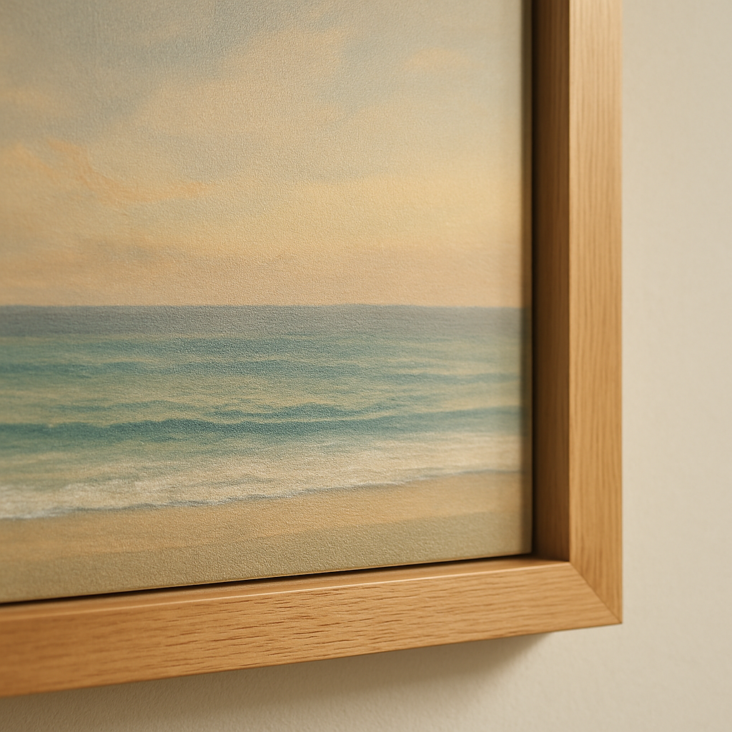
Second, consider the artwork itself. Photorealistic landscapes often shine on glossy or satin paper, whereas minimalist sketches feel more authentic on textured cotton.
Third, budget matters – cotton rag costs a bit more, but for a one‑off gift it can feel like a luxury upgrade you’ll brag about.
Finally, test a small sample if you can. Seeing how the ink settles on the surface saves you from a costly surprise later.
TL;DR
Choosing the best paper type for art prints means matching finish, weight, and durability and lasting appeal to your gift’s setting, lighting, and personal style.
Our quick checklist helps parents, spouses, and gift‑buyers pick matte for glare‑free walls, satin for balanced shine, or glossy cotton rag for vibrant, museum‑like results.
Option 1: Matte Cotton Paper
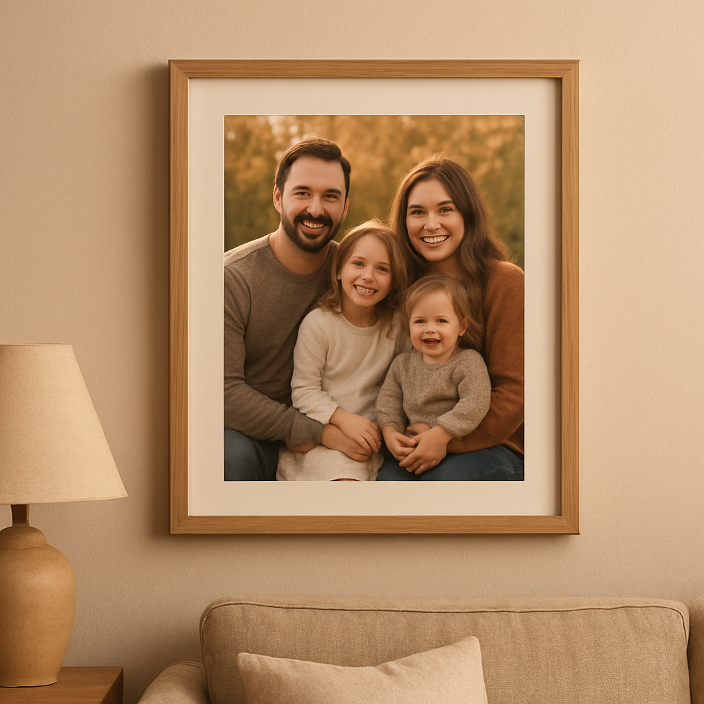
Ever notice how a family portrait on glossy paper can feel a bit like a billboard, while the same image on matte cotton paper just... sighs? That soft, almost whisper‑like finish is what makes matte cotton a favorite for gift‑givers who want their prints to feel intimate, not flashy.
Here’s why matte cotton often lands at the top of the list when you’re hunting for the best paper type for art prints that will live on a wall for years.
1. Glare‑free elegance
Imagine a bright kitchen window throwing sunlight across a framed print. On glossy stock, you end up squinting or moving the piece. Matte cotton absorbs that light, so the image stays true to colour without that harsh shine. Parents love this for kids’ artwork because the colors stay vivid without the constant battle against reflections.
2. Texture you can feel
Matte cotton isn’t just flat; it has a subtle grain that you can run your fingers over. That tactile quality makes a photo feel like a piece of fine art rather than a printer‑jet output. Spouses often mention how they “feel” the memory when they touch the paper – it adds an extra layer of sentiment.
3. Archival stability
Most matte cotton papers are acid‑free and lignin‑free, meaning they won’t yellow over time. For a gift that’s meant to become a family heirloom, that longevity matters. We’ve seen grandparents proudly display a matte cotton print of a newborn that still looks fresh after a decade.
4. Colour depth without oversaturation
Because there’s no glossy coating to bounce light, colours appear rich but not exaggerated. That’s perfect for pastel‑heavy family photos or soft watercolor‑style artwork. The result is a balanced, natural look that feels right at home in a living‑room gallery.
So, how do you decide if matte cotton is right for your next print?
- Lighting: If the wall gets a lot of natural light, matte will keep glare at bay.
- Style: Choose matte for classic, timeless images – think black‑and‑white portraits or vintage family snapshots.
- Budget: Matte cotton sits in the mid‑range – a little pricier than standard brochure paper but less costly than heavyweight cotton rag.
Now, let’s watch a quick walkthrough that shows the printing process for matte cotton paper and why it feels different from glossy options.
Notice how the printer lays down the ink slowly, letting it settle into the fibers. That patience is part of what gives matte cotton its depth.
5. Practical tip: Test a small strip
Before committing to a full‑size print, ask your printer (or use a local print shop) for a small sample strip. Look at it under different lights, run your finger over it, and see how the colours hold up. This tiny step saves you from a costly surprise later.
And if you’re a DIY‑enthusiast, you can even order a single sheet to try at home. Many online services let you order a single matte cotton sheet for under $10.
Finally, think about framing. Matte cotton pairs beautifully with simple wooden frames or sleek metal ones – the low‑shine surface lets the frame shine without competing for attention.
Whether you’re sending a birthday surprise to a spouse or creating a keepsake for a parent, matte cotton offers that perfect blend of softness, durability, and timeless charm.
Option 2: Glossy Photo Paper
When you want colors to pop like fireworks on a birthday wall, glossy photo paper is the go‑to. The high‑shine surface reflects light, which makes reds richer, blues deeper, and whites brighter. It’s the kind of finish that makes a viewer do a double‑take, especially in rooms with plenty of natural or ambient light.
But glossy isn’t just about flash. It actually holds ink droplets in a smoother layer, which means the printer can lay down finer detail. Think of a family portrait where every freckle and strand of hair is crystal‑clear – that’s the kind of precision glossy paper delivers.
Why glossy works for certain gifts
If you’re a gift‑buyer looking to wow a friend with a vibrant travel poster, the glossy sheen turns a flat image into a mini‑window to the world. Parents who want a colorful nursery print of a jungle scene will love how the glossy finish makes the greens leap off the wall, turning a simple room into a mini‑safari.
Spouses often choose glossy for anniversary photos because the extra shine adds a “special‑occasion” feel. It’s the visual equivalent of pulling out the fancy dinnerware – you know you’re celebrating something important.
Real‑world examples
One of our customers ordered a glossy print of a sunrise over the Rockies for their living‑room gallery wall. The result? The orange hues looked almost luminous, and guests kept asking where they could get a similar print.
Another example: a parent printed a glossy sheet of a whimsical cartoon character for their child's playroom. The glossy finish helped the colors stay vivid even after a few weeks of enthusiastic finger‑painting and wall‑bumping.
How to test glossy before you commit
1. Order a single‑sheet sample. Most POD services, including heartful.gifts, let you preview a single 8×10 glossy print. Hold it up to both natural daylight and a lamp – you should see the colors sparkle without any dull spots.
2. Check for glare. Stand the sample near a window; if the reflection is too harsh, you might want a semi‑gloss instead. A quick test with a piece of white paper held at a 45‑degree angle can reveal how much light bounces off.
3. Feel the weight. Glossy paper often comes in 180–200 gsm, giving it a sturdy feel that resists bending, which is perfect for framing without a heavy mat.
Expert tip: archival‑grade glossy
Not all glossy papers are created equal. For long‑term displays, look for archival‑grade options that resist yellowing. Giclee‑style glossy papers are certified to last up to a century in normal lighting, so your gift won’t fade into the background over time.
Framing and care
Because glossy surfaces show fingerprints, choose a frame with UV‑filtering glass or acrylic. A simple acrylic cover not only protects the shine but also reduces glare from overhead lights. When you clean, use a microfiber cloth and a gentle, alcohol‑free solution – never spray directly on the print.
Mounting the print with archival‑grade tape or acid‑free corners adds extra stability, especially if you’re using a larger size like 16×20. This prevents the paper from warping over the years.
Quick checklist for glossy paper
- Do you need vivid, eye‑catching colors? Yes → glossy.
- Is the print going in a bright room? Test for glare first.
- Will the print be a keepsake? Choose archival‑grade glossy.
- Budget OK for a slightly higher‑priced stock? Glossy usually costs a bit more than matte.
And if you’re still on the fence, remember you can always compare a glossy sample to a matte one side‑by‑side. Seeing the difference in person is the fastest way to know which finish fits your gift’s personality.
In the end, glossy photo paper isn’t just a surface – it’s a storytelling tool that amplifies color, detail, and that “wow” factor that makes a gift feel truly special.
Option 3: Semi‑Gloss Fine Art Paper
Ever held a print that felt like a smooth stone, yet still showed a whisper of shine? That’s the sweet spot of semi‑gloss fine art paper, and it’s the kind of surface that makes a gift feel both polished and tactile.
We’ve seen parents choose it for a newborn’s first portrait because the subtle sheen brings out the tiny details without the glare of full gloss. Spouses love it for anniversary photos – the light catches the edges just enough to feel special, but the paper still reads like a conversation rather than a billboard.
What makes semi‑gloss fine art paper special?
Unlike pure glossy stock, semi‑gloss has a micro‑coated surface that holds ink in a thin, even layer. The result is richer colour saturation, especially in landscape shots, while preserving the depth of black‑and‑white images. Because the coating is lighter, fingerprints are less noticeable and the paper feels heavier in the hand.
One photographer’s test pack (see the semi‑gloss fine art paper review) highlighted the Palo Duro Softgloss Rag – a 310 gsm cotton rag that balances weight, texture, and a gentle luster. That same paper was praised for its “silky” feel and neutral colour rendition, which is exactly what you want when you’re sending a gift that should look timeless.
Who really benefits from this finish?
Think about a friend who’s into vibrant travel posters. The semi‑gloss will let the sky blues and desert reds pop, but the surface won’t scream for attention when the print hangs in a softly lit hallway. If you’re a gift‑buyer looking for something that works both in a bright kitchen and a dim bedroom, this is the happy‑medium.
For parents, a semi‑gloss print of a child’s artwork captures the crayon texture while adding a hint of sparkle that makes the piece feel gallery‑ready. And for spouses, a romantic black‑and‑white portrait gains just enough depth to feel intimate without the harsh shine that can feel “too much”.
How to test before you commit
1. Order a single‑sheet sample. Most POD services, including heartful.gifts, let you pick an 8×10 semi‑gloss sheet. Hold it up to natural light and a lamp – you should see colour vibrancy but only a soft glow.
2. Check for glare. Tilt the sample; a true semi‑gloss will reflect light gently, not like a mirror. If you see a harsh reflection, you might be looking at a full gloss.
3. Feel the weight. Look for 300 gsm or more; heavier cotton rag papers feel sturdy and won’t curl over time.
After you’ve got a feel for the texture, compare it side‑by‑side with a matte or full‑gloss sample. That little experiment often clears up any doubt about which finish matches the personality of your gift.
Framing & long‑term care
Because semi‑gloss still has a slight sheen, fingerprints can show up, but they’re easier to wipe away than on full gloss. Use a microfiber cloth and a gentle, alcohol‑free cleaner – never spray directly on the paper.
UV‑filtering glass or acrylic is still a smart move, especially for sun‑lit rooms. It protects the ink from fading and reduces any residual glare. Archival‑grade tape or acid‑free hinges keep the paper flat without risking yellowing.
Quick checklist for semi‑gloss fine art paper
- Do you want vivid colours without harsh glare? Yes → semi‑gloss.
- Is the print a keepsake that will live in different lighting conditions? Semi‑gloss adapts well.
- Do you need a heavyweight, cotton‑rag feel? Look for 300 gsm+ options.
- Budget okay for a premium finish? Semi‑gloss usually sits between matte and glossy pricing.
Bottom line: if you’re after a paper that delivers depth, colour richness, and a touch of elegance without the glare of full gloss, semi‑gloss fine art paper is often the best paper type for art prints when you want a gift that feels both luxurious and versatile.
Option 4: Textured Watercolor Paper
Ever felt that a flat print just… doesn’t hug the eye the way a real watercolor does?
That’s the moment when textured watercolor paper steps in. It gives the print a subtle tooth that catches light like actual brushstrokes, turning a digital file into something you’d want to run your fingertips over.
For gift‑buyers, parents, or spouses looking to celebrate a special moment, that tactile cue can be the difference between “nice” and “memorable.” Imagine sending a newborn’s portrait printed on a paper that whispers “hand‑made” every time you glance at it.
What makes texture count?
Texture isn’t just about looks; it influences how pigment inks settle. Papers with a cold‑pressed feel absorb a tiny bit of ink, which softens harsh edges and preserves the delicate gradients that watercolor fans love.
In the world of fine‑art printing, the Louise De Masi guide notes that pigment‑based inks pair best with papers that can handle up to 350 gsm thickness without jamming. That’s exactly the sweet spot for most textured watercolor stocks.
Best use‑cases for textured watercolor paper
- Family portraits where you want a soft, organic vibe.
- Travel posters that aim to look like a printed sketchbook page.
- Kids’ artwork reproductions – the texture mimics the original crayon or watercolor paper.
And because the surface isn’t glossy, fingerprints are far less noticeable – a practical perk for busy households.
How to test before you commit
1. Order a single‑sheet sample (most POD services, including heartful.gifts, let you do this).
2. Hold it up to daylight and a lamp. Do the ridges catch light in a way that feels “alive”?
3. Print a small, colour‑rich test image. Does the ink look soft, or does it pool?
If the answer is “yes,” you’ve found a winner.
Framing and long‑term care
Because textured paper is a bit more porous, UV‑filtering glass or acrylic is a smart move – it blocks fading while still showcasing the surface texture.
Mount with archival‑grade tape or acid‑free corners. Avoid heavy adhesives that could crush the subtle grain over time.
Quick checklist for textured watercolor paper
- Do you want a paper that feels like real watercolor? Yes → textured.
- Is the print a keepsake that will be handled often? Texture hides fingerprints.
- Do you need a heavyweight stock (300‑350 gsm)? Look for cold‑pressed or “cold‑press” labels.
- Budget okay for a premium finish? Textured fine‑art papers sit between matte cotton and semi‑gloss pricing.
When you start scouting brands, look for names that consistently show up in professional studios. Hahnemühle’s William Turner 310 gsm is a cold‑pressed paper that mimics the absorbency of traditional watercolor sheets while still handling pigment inks flawlessly. Canson Infinity’s Aquarelle Rag 310 gsm offers a slightly rougher feel, perfect for reproducing the grain of hand‑painted sketches. Both options sit comfortably in the 300‑350 gsm range, so they won’t buckle in a standard frame.
Once your print is framed, store any spare sheets flat in a dry, temperature‑stable drawer, wrapped in acid‑free tissue. Avoid plastic sleeves that can trap moisture and cause the texture to warp over time.
| Feature | What it Offers | Why it Matters |
|---|---|---|
| Cold‑pressed texture | Subtle tooth that catches light | Creates a hand‑made, organic feel |
| Weight (300‑350 gsm) | Sturdy, less warping | Handles framing without bowing |
| Ink compatibility | Works with pigment inks | Ensures archival longevity and colour fidelity |
Bottom line: if you’re after the “real watercolor” vibe for a gift that will be cherished for years, textured watercolor paper is often the best paper type for art prints. It blends visual depth with tactile charm, and it plays nicely with the pigment inks we trust for archival quality.
Option 5: Archival Canvas Paper
Picture this: you’ve just designed a custom canvas print for a parent who wants their kid’s first art masterpiece to live on the wall for decades. You love the idea of a sturdy, museum‑grade finish, but you also don’t want the colors to fade after a few years of sun‑drenches. That’s where archival canvas paper steps in, and it’s quickly becoming one of the best paper type for art prints when durability matters as much as look.
Why “archival” isn’t just a buzzword
Archival canvas paper is built with acid‑free, lignin‑free fibers. In plain English, that means the material won’t yellow or become brittle as time goes on. The surface is coated with a micro‑porous layer that lets pigment‑based inks settle evenly, giving you vivid colour without the glossy glare of a traditional canvas.
For gift‑buyers, that translates to a present that still feels fresh on a birthday or anniversary five years down the line. For parents, it means a child’s crayon‑filled masterpiece stays as bright as the day they made it, even after countless hugs and accidental spills.
Weight and texture – what you’ll actually feel
Most archival canvas stocks sit around 300–350 gsm, giving them a solid heft without being overly rigid. The texture is subtly textured, like a fine‑grain linen, so your fingers can sense the quality without the paper feeling “paper‑like.” It’s a happy middle ground between the flat feel of matte cotton and the deep, plush feel of stretched canvas.
Because it’s heavier, you won’t need a thick frame to keep it from warping. A simple 1‑inch wooden frame with a matte mat board does the trick, and the canvas stays flat for years.
Perfect use‑cases for archival canvas
- Family portraits that need to survive sun‑lit hallways.
- Travel or landscape prints that you want to showcase in a bright living room without glare.
- Kids’ artwork that gets handled a lot – the surface resists fingerprints better than glossy.
Think about a spouse who wants a romantic black‑and‑white photo of the two of you. The archival canvas gives the image depth, a slight sheen, and the peace of mind that it won’t yellow on a sunny window wall.
How to test before you commit
1. Order a single‑sheet sample from your POD provider. Most services let you grab an 8×10 piece for a few dollars.
2. Hang it in the room where it will live. Look at it in morning light, afternoon glare, and evening lamp glow. Does the colour stay true? Does the texture catch the eye without looking “shiny”?
3. Run a quick finger test – gently rub a fingertip across the surface. A good archival canvas will feel slightly textured but won’t smudge ink.
Framing tips that keep it safe
Because the paper is acid‑free, you don’t need a special archival backing, but UV‑filtering glass or acrylic is still a smart move. It blocks the harshest rays that can accelerate fading, especially in rooms with big windows.
Mount the print with archival‑grade tape or acid‑free corners. Avoid heavy glues that could compress the delicate weave over time.
And here’s a quick pro tip: add a breathable spacer between the canvas and the glass. It lets air circulate, reducing the risk of moisture build‑up that can cause clouding.
Quick checklist for archival canvas paper
- Do you need a print that resists yellowing and warping? Yes → archival canvas.
- Is the gift meant for a space with lots of natural light? Pair with UV‑filtering glass.
- Do you want a sturdy, heavyweight feel without a deep‑canvas stretch? Look for 300–350 gsm paper.
- Budget okay for a premium, museum‑grade material? Archival canvas sits a bit above standard matte cotton but delivers long‑term value.
Bottom line: when you’re hunting for the best paper type for art prints that balances durability, colour fidelity, and a touch of tactile elegance, archival canvas paper should be at the top of your list. It gives gift‑buyers the confidence that their present will look just as lovely ten years from now, and it lets parents preserve those priceless first‑drawings without worrying about fading or damage.
Quick Comparison of All Paper Types
Alright, you’ve already seen the pros and cons of each stock. Now let’s line them up side‑by‑side so you can see at a glance which one feels like the perfect fit for your next gift.
Matte Cotton Paper
Think of matte cotton as the “soft‑spoken friend” of the bunch. It offers a buttery, non‑glare surface that lets colours settle naturally. At roughly 170–210 gsm it feels substantial without being heavyweight, and the texture is just enough to hint at a fine‑art feel.
Best for: family portraits, baby milestones, any space that gets a lot of light and you want to keep fingerprints invisible.
Glossy Photo Paper
If you want colours that pop like fireworks, glossy is the go‑to. The high‑shine coating bounces light back, making reds richer and blacks deeper. It usually sits around 180–200 gsm, so it’s sturdy enough for a frame without a thick mat.
Best for: vibrant travel posters, kids’ room art, moments you want to shout “wow!” from the wall.
Semi‑Gloss Fine Art Paper
Semi‑gloss lands right between matte and glossy. A micro‑coated surface gives you that subtle sheen while keeping glare low. The weight often climbs to 300 gsm or more, which means a luxurious heft that feels like a gallery print.
Best for: black‑and‑white portraits that need depth, landscape shots that deserve a little extra colour punch, and gifts that need to look polished without the glare of full gloss.
Textured Watercolor Paper
Texture is the secret sauce here. A cold‑pressed, 300–350 gsm sheet adds a gentle tooth that catches light, making digital ink behave a bit like real watercolor pigment. The surface is porous enough to soften harsh edges but still holds colour faithfully.
Best for: artistic sketches, children’s drawings, any piece where you want a hand‑made vibe that hides fingerprints.
Archival Canvas Paper
Archival canvas is the heavyweight champion for durability. Acid‑free, lignin‑free fibres keep the print from yellowing, and the micro‑porous coating delivers vivid colour without the glossy glare. At 300–350 gsm it feels solid, yet it stays flat in a simple frame.
Best for: heirloom‑level family photos, landscape panoramas that live in sunny hallways, and any gift where you need the print to last a decade or more.
Side‑by‑Side Quick Checklist
- Glare‑free? → Matte Cotton or Textured Watercolor.
- Maximum colour impact? → Glossy Photo.
- Balanced shine + heavyweight feel? → Semi‑Gloss Fine Art.
- Hand‑crafted look + fingerprint masking? → Textured Watercolor.
- Long‑term archival safety? → Archival Canvas.
So, which one feels right for you? If you’re sending a newborn’s first portrait to a parent, the matte cotton’s soft finish and glare‑free surface usually wins. For a friend who loves bold, modern art, glossy or semi‑gloss will give that eye‑catching pop. And when you need a timeless piece that can survive years of sunlight, the archival canvas is the safe bet.
One quick tip from our own workflow: order a single‑sheet sample of the top two contenders before you commit to a full run. Hold each up to the room’s lighting, run a finger across the surface, and picture the moment the recipient opens the gift. That tactile test often settles the decision faster than any online review.
Remember, the “best paper type for art prints” isn’t a one‑size‑fits‑all answer – it’s the one that matches the artwork, the space, and the emotions you want to convey. Use this comparison as your cheat‑sheet, pick the paper that lines up with your gift’s story, and you’ll end up with a print that feels as thoughtful as the gesture itself.
FAQ
What paper should I choose for a newborn portrait gift?
When you’re sending a newborn’s first portrait, you want a surface that feels soft and stays glare‑free. Matte cotton paper is usually the safest bet – its subtle grain gives a warm, museum‑like look, and the lack of shine means the tiny details aren’t washed out by reflections. The heavier weight (around 200 gsm) also holds up well in a simple frame, so the gift looks polished for years.
How does the finish affect color vibrancy?
Finish isn’t just about looks; it changes how ink interacts with the sheet. Glossy stock pushes ink to sit on top, which ramps up saturation and makes reds and blues pop like fireworks. Semi‑gloss gives most of that punch but tones down the mirror‑like glare, while matte lets pigments settle into the fibers for a softer, more natural feel. Pick the finish that matches the lighting of the room where the art will live.
Is glossy paper durable for long‑term gifts?
Glossy paper can look stunning, but it isn’t the most forgiving when it comes to fingerprints and UV exposure. Over time, a high‑gloss surface can yellow if it isn’t archival‑grade, and the shine makes smudges obvious. For gifts meant to last decades—like a wedding portrait or a family landscape—consider a semi‑gloss or archival‑grade matte that balances durability with visual impact.
Can I order samples before deciding?
We always tell customers to order a single‑sheet sample of their top two contenders. It costs only a few dollars and lets you hold the paper, test the color under your home lighting, and feel the weight before committing to a full order. When you compare a matte and a semi‑gloss side‑by‑side, the tactile difference often decides which finish tells your story best.
What’s the difference between semi‑gloss and matte cotton?
Matte cotton feels like a soft, heavyweight canvas with no sheen, making it ideal for sentimental gifts where you don’t want glare to distract. Semi‑gloss, on the other hand, adds a whisper of shine that brings out colour depth while still keeping reflections low enough for most rooms. The trade‑off is texture: matte cotton has a finer grain, whereas semi‑gloss often uses a cotton‑rag base that feels heftier in the hand.
How do I protect a print from UV damage?
Protecting a print from UV damage is easier than you think. The most effective step is to frame it behind UV‑filtering glass or acrylic, which cuts out the harshest rays without dulling colour. If you’re going for a more minimalist look, consider a UV‑blocking spray that you apply once the print is dry. Keep the piece out of direct sunlight for long‑term preservation, especially in rooms with large windows.
Do textured watercolor papers work with photo‑printer inks?
Textured watercolor paper can handle pigment‑based inks, but you need to check the printer’s specifications for maximum paper thickness. Most modern inkjet machines accept 300‑350 gsm cold‑pressed stock without jamming, and the subtle tooth helps soften harsh edges, giving a more painterly feel. If you’re using a POD service, request a sample first; that way you can confirm the texture works with your chosen image and colour palette.
Conclusion
We've walked through matte cotton, glossy, semi‑gloss fine art, textured watercolor, and archival canvas, so you can match the finish to the emotion you want to deliver.
If a newborn portrait needs a soft, glare‑free hug, matte cotton still wins. For a bold travel poster that screams “wow,” glossy gives the pop you crave. When you want depth without harsh shine, semi‑gloss balances colour and subtle sheen. Textured watercolor adds that hand‑made vibe, perfect for kids’ art or sketch‑style gifts. And when a family heirloom must survive decades of sunlight, archival canvas is the safest bet.
So, what’s the next step? Grab a single‑sheet sample of your top two contenders, hold it up to the room’s lighting, and imagine the moment the recipient unwraps it. That tactile test usually settles the choice faster than any checklist.
Remember, the “best paper type for art prints” isn’t a one‑size‑fits‑all answer – it’s the paper that aligns with the artwork, the space, and the feeling you want to capture.
Ready to turn your favorite photo into a gift that truly resonates? Our print‑on‑demand service at heartful.gifts makes ordering samples and final prints a breeze, so you can focus on the joy of giving today.